Berg Engineering: Website Design
Complex B2B ecommerce catalog streamlined into lean, mobile-friendly store.
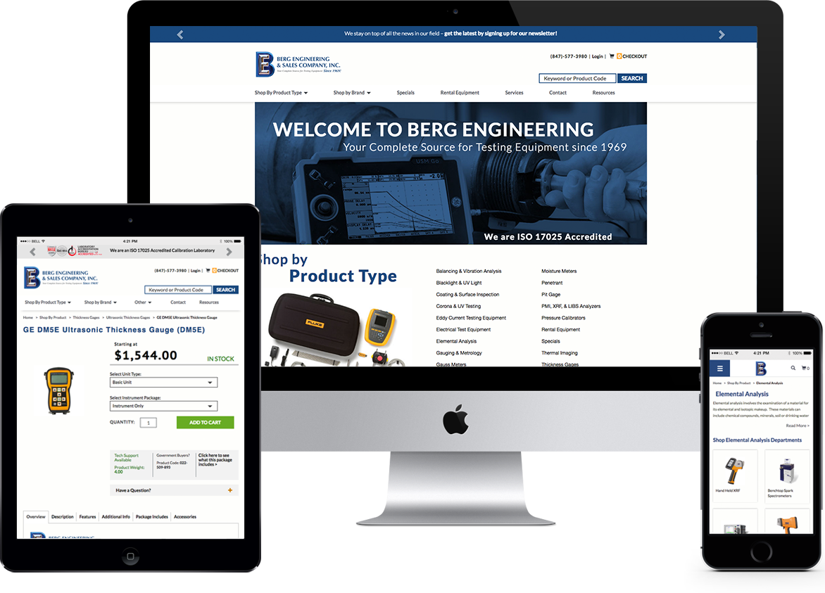
No B2B catalog is too complex. With a ground-up approach and logical thinking, anything is possible.
Berg Engineering is a B2B powerhouse selling nondestructive testing equipment in sectors like the oil and gas industry, manufacturing, and aerospace. Nondestructive testing (NDT) allows operators to detect dangerous flaws in materials before the structures fail. Commercial aircraft, oil and gas pipelines, bridges, and other important technologies are all monitored for safety in this way. These devices literally save lives and prevent disaster.
Because it’s so specialized, the NDT market is incredibly complex. That leads to a complicated ecommerce catalog and a potential nightmare for store organization. We knew that simplicity of navigation and efficiency of code would be critical to the Berg Engineering redesign.

Redundancy was a necessary evil in the old store. But why not eliminate it?
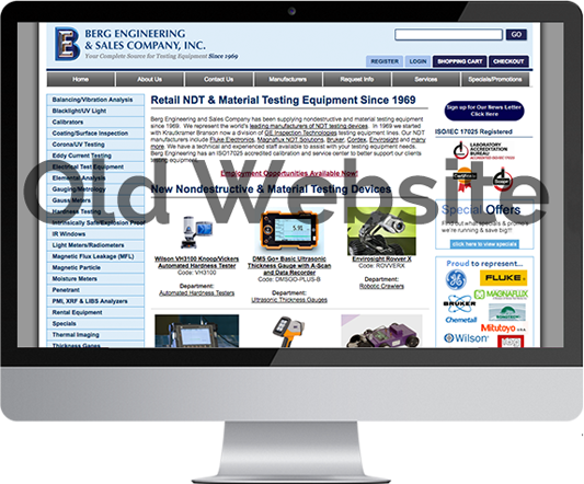
Berg Engineering was running an aging, complex B2B ecommerce store on the Miva platform. Because NDT equipment is highly specialized, many of the instruments are sold in more than one variation to fit highly specific applications. In Berg’s old ecommerce store, that meant numerous duplicate products which differed only in specific product attributes.
This was a problem for several reasons. First, it meant duplicate content on multiple pages, which was hurting Berg’s SEO. Second, from the perspective of user experience, B2B customers had to sort through several different product pages to find the variant with the exact attributes which their application required. In a word, both Google and human users were suffering from the redundancy.
Communication: The bedrock of the client/agency relationship.
At 216digital, we approach every project as a collaboration between client and agency. That means that communication is crucial to success. In the case of Berg Engineering, the client brought a deep knowledge of their catalog and their B2B industry to the table. We brought the design and development expertise that could realize Berg’s needs. But we only achieved this synergy through constant communication. As the project unfolded, we spoke to Berg’s product catalog manager 3+ days a week for several months. We could not have created such a highly functional B2B ecommerce website without this intense cooperation between 216digital and Berg Engineering.
Product variants: eliminating redundancy without cutting product options.
In Berg’s new ecommerce store, we introduced product variants as an alternative to duplicate products. Now, all the variations of a product live under one base URL. This means better organization and a cleaner user experience. It also means Google doesn’t see any duplicate content.
The new store is smart. With product variants built in, changing the package option changes price, weight, and what is inside the package. Everything is seamless.
Shop by product type or manufacturer: Multiple entry points for multiple B2B users.
Ecommerce UX (user experience) design has evolved rapidly over the last few years. It’s no longer enough to provide one type of catalog organization. This is especially true for more complex B2B stores. Today’s mobile customer expects products organized in a way that fits his or her thinking. Trouble is—everyone thinks differently!
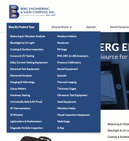
In the case of Berg Engineering, we realized that two main points of entry were necessary. Some customers would come to the site knowing only the application for which they needed equipment. For them, shopping by product type was the perfect solution. This menu organizes Berg’s catalog around specific NDT technologies—hardness testing, thermal imaging, and more.
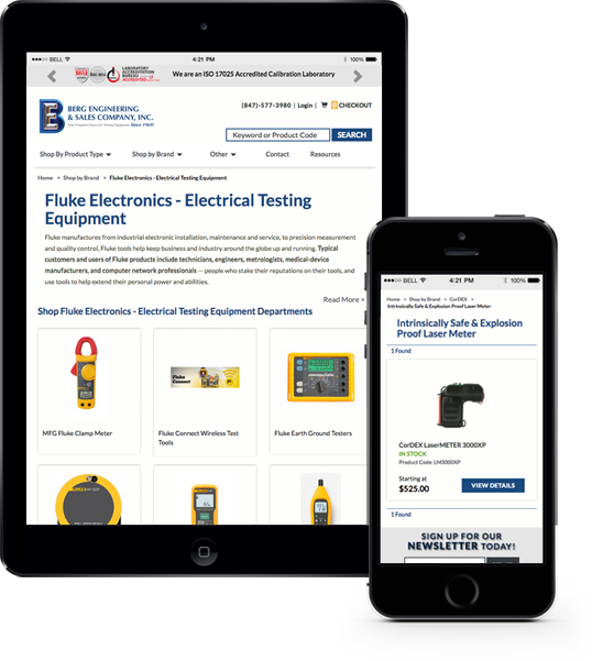
Some customers will find it easier to shop by brand. Under this organizational system, all of a manufacturer’s subtypes appear on one page. Clicking further into this leads the user to the same product pages which are accessible from the product type menu. One catalog, two points of entry.
Ready to build Something Amazing?
Let’s get started!
Dynamic code updates site navigation automatically.
The longer you run an ecommerce store, especially in B2B, the more you find yourself revising your offerings. New products come, and old ones are discontinued. As your industry changes, you may even need to add a new category to your store.
In the old days, big changes like a new category would require hard coding revision. But we saved Berg time and money by building a dynamic backend. Now, when Berg management wants to add a new category to the store, that category will show up automatically in the navigation row, the mobile navigation panel, and the homepage body. One change, dynamically displayed in 3 locations. Now that’s efficient.
Mobile responsive design: Critical to success in B2B ecommerce
Mobile responsive design isn’t just for the B2C ecommerce market. As the B2B ecommerce market explodes, the industry is waking up to the fact that B2B buyers are increasingly shopping from mobile phones. We expect this to cause a seismic shift in B2B ecommerce web design over the next few years, and we wanted to put Berg Engineering ahead of the curve.
That’s exactly what we did. The clean, flat design scales beautifully on all screen sizes, and it offers a quick and seamless journey to the product which the customer needs.
Homepage: Displaying B2B thought leadership in a highly technical niche.
Because the NDT niche is so technical, the community tends to focus on practicing NDT rather than talking about it. There aren’t a lot of NDT blogs, though there are plenty of training providers and trade publications. The NDT world is ripe for great content marketing, and Berg is perfectly positioned to fill this niche. The homepage dynamically pulls the latest articles from the Knowledge Base, where Berg publishes expert content that gets lots of industry attention.

Excellence: It’s in the details.
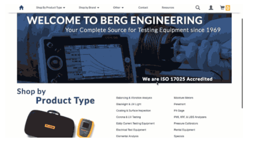
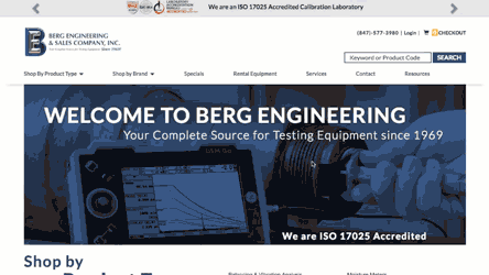
We believe that great web design requires an exacting attention to detail. In the case of a B2B ecommerce store, web design must ultimately increase the bottom line while serving many different types of customers. Today’s ecommerce store requires multiple newsletter opt-ins to help build a dedicated customer base. For Berg Engineering, we integrated these opt-ins seamlessly, without interrupting the navigation experience on desktop, tablet, or mobile. These opt-ins are placed strategically in the header, footer, at checkout, and in a modal popup.
With the emergence of the sticky header trend, we’re surprised at how many sites display the full, fat header when the user scrolls. We believe this eats up valuable real estate.
The user has already seen the full content of the header, and it’s only natural to scale down to a slim header as the user scrolls. We built a beautiful, simple slim header for Berg Engineering. It maintains all the functionality of the full header, but uses real estate carefully to remain clear and user-friendly.
We also built a Hello Bar for Berg. This thin slider at the top of the site transitions between a newsletter signup and Berg’s ISO accreditation. Berg is an ISO 17025 Accredited Calibration Laboratory, which is a powerful trust mark within the industry.
The Bottom Line
A complex catalog doesn’t have to create an unmanageable B2B ecommerce store. Logical problem-solving coupled with a deep understanding of a client’s needs produces incredible results. At 216digital, we do this every day for a wide range of ecommerce clients, both B2B and B2C. What are you waiting for? Get in touch, and let’s start talking about your next big thing.