‘Tis the season of joy, laughter, and, of course, holiday shopping! As the holiday spirit fills the air, retailers are gearing up to capture their share of the holiday shopping extravaganza. But in the midst of the twinkling lights, festive decor, and holiday cheer, there’s an aspect you may be overlooking – web accessibility.
To add an extra dose of cheer to this season, our team at 216digital has put together a list of simple and immediate steps that every online retailer can take to ensure their online content caters to all shoppers.
‘Tis the Season for All Shoppers
The holiday season is when people actively hunt for gifts and turn to online shopping in their quest for the perfect presents. However, many website owners are missing out on a massive, often overlooked market share: people with disabilities.
According to the World Health Organization, roughly 16% of the world’s population has some form of disability. When your website isn’t accessible, you’re closing the door on this large group of potential consumers.
To put this into perspective, let’s consider some statistics:
- In the United States, approximately 27% of adults have some form of disability. That’s more than 61 million people who could become your future customers.
- Shoppers with disabilities have a combined disposable income of about $490 billion. By neglecting their needs, you are missing out on a substantial source of revenue.
- Research has shown that 71% of disabled customers will leave a website if they find it difficult to use. Therefore, improving web accessibility can have a direct impact on your conversion rates.
Holiday Shopping Challenges
For people with disabilities, shopping online can pose challenges. According to WebAIM’s 2023 analysis of the top 1 million websites on the internet, a staggering 96.3% of them had severe accessibility issues. These issues included the inability to view product descriptions, make a purchase, or book an appointment.
During the holiday shopping season, people with disabilities may face even more challenges while shopping online. For instance:
- Most holiday promotions are shared through email or social media, which can be challenging to access for some people with disabilities.
- Each website update, which often includes fresh branding, promotional banners, and product pages, presents an opportunity to introduce new accessibility barriers
- The holiday rush can overwhelm customer service teams, making it more challenging for people with disabilities to receive the assistance they may need.
So, how can you make your website accessible to all holiday shoppers?
Understanding Web Accessibility
Web accessibility is about making your website usable and navigable by people with disabilities. That means designing and developing your holiday content in a way that allows everyone to access and use your site effectively.
Here are a few key aspects of web accessibility you should focus on this holiday season.
Paint a Clear Picture with Alt Text
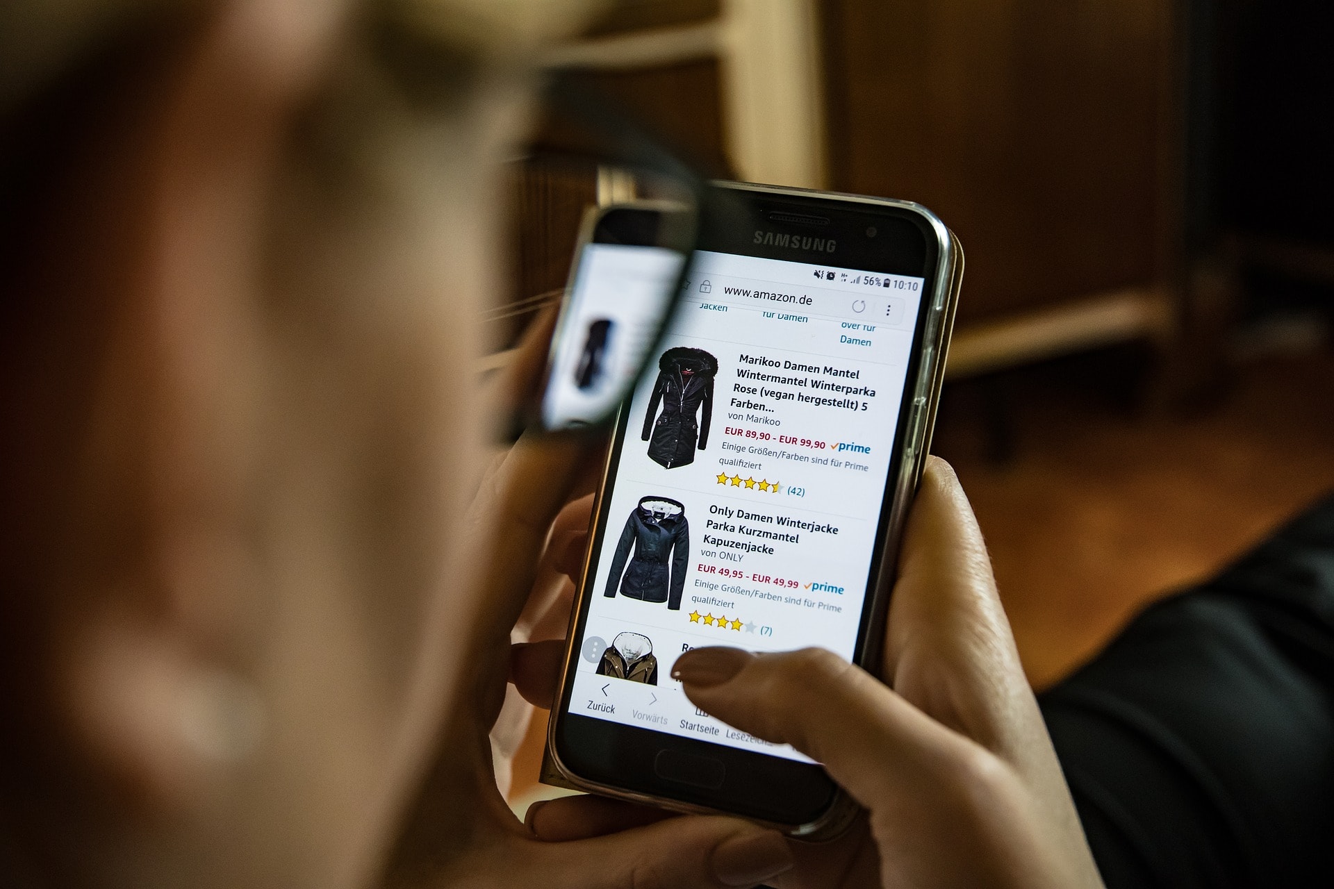
During the holiday season, visuals play a significant role in attracting shoppers to your site. In fact, 75% of online shoppers rely on product photos when purchasing. However, some users may have visual impairments and rely on screen readers to navigate your website. To make sure they don’t miss out on your visually appealing content, it’s crucial to use image alternative text or alt text.
What is Alt Text?
Alt text is a description added to an image’s HTML code. It provides a textual alternative to the image, allowing screen readers to convey the image’s content and function to users who cannot see it.
When done right, it can help paint a picture of your products and services. Unfortunately, many businesses forget to provide alt text, or they treat it like a file naming system. For example, an image of a size chart with alt text that says “size chart.” It might as well not be there.
You can write more helpful alt text by following these best practices:
Be Descriptive
When adding alt text to your images, be descriptive but concise. For instance, if you’re selling a holiday-themed sweater, the alt text could be “Cozy red holiday sweater with reindeer patterns.” This way, users with visual impairments understand the image’s content.
Avoid Redundancy
It might seem helpful but do not include phrases like “picture of” or “image of” in your alt text. Screen readers will know from the preceding HTML tag to announce the alt text as an image. Including these phrases in your description will only disrupt the user’s experience.
Write for People, Not Search Engines
It’s important to remember not to treat alt text as an SEO tool. Many content creators make the mistake of trying to include keywords in their site’s alt text. But while alt text can contribute to SEO, your priority should be accessibility and user experience. Remember, at the end of the day, you’re trying to sell a product to a person, not Google. So, focus on creating descriptive and concise alt text that helps users with visual impairments understand the image’s content.
For more information on alt text, check out our article “Understanding Image Alt Text Descriptions.”
Design for Sound Off Videos
Videos are an engaging way to showcase your holiday products or promotions. However, videos often rely on visual and auditory elements, which can be problematic for those with hearing impairments. To make your videos more inclusive:
- Invest in High-Quality Audio: If you use VoiceOvers or soundtracks in your videos, ensure that the audio quality is top-notch. Clear audio is essential for users who rely on sound to understand your content.
- Use Audio Descriptions: For videos with crucial visual content, provide audio descriptions. Audio descriptions are narrations that explain what’s happening in the video. This helps users with visual impairments understand the context and content of the video.
- Proof Captions by Hand: Automatic captioning can be unreliable, and errors in captions can lead to misunderstandings. Take the time to review and edit captions to ensure they accurately reflect the spoken content.
Make Your Email Campaigns Web Accessible
Email marketing is a powerful tool during the holiday season. However, most of the images used in email marketing lack accessibility.
For instance, in many promotional emails, you’ll find special offers, product names, sale prices, and other important information. If all of this information is only presented in images, it excludes people who rely on screen readers.
As a general rule, businesses should avoid using images as the sole content of their emails. And when images are used, they must include descriptive alt text. However, there’s more to email accessibility than just alt text.
To ensure that your emails reach and resonate with all potential customers, consider the following:
- Set the Role Attribute of Every Table to “Presentation.”: Tables in emails can be challenging for screen readers to interpret. By setting the role attribute of every table to “presentation,” you tell assistive technologies that the table is for layout purposes only, making the email easier to navigate.
- Underline Inline Links: When creating links in your emails, use descriptive link text. For example, instead of “Click here,” use “Shop our holiday collection now.” This provides clarity and context to users.
- Make Sure Links are Descriptive: When creating links in your email content, use descriptive anchor text that indicates where the link leads. Avoid generic terms like “click here” and instead use specific text that tells users what to expect when they click.
Heading Towards Holiday Content
It’s that time of year when new content and blog articles are in full swing, highlighting future sales and this year’s latest products. However, the essential element of all good content is using headings. Headings aren’t just big, bold, decorative text. They’re the signposts that guide readers through your content from most to least important.
For instance, just like a tree has a trunk, main branches, and smaller branches, your content should have a main heading, subheadings, and further divisions if necessary.
- Here are a few pointers when you are generating your online content:
- Write concise, meaningful headings that provide insight into the content.
- Elements that are repeated across different pages within a site should maintain a consistent order. That one bold font may be more eye-catching, but that doesn’t mean you need to use it.
- Headings and labels should aid shoppers in navigating content and understanding their current location by clearly describing the topic or objective.
Don’t Let Web Accessibility Be Your New Year’s Resolution
The holiday season is the perfect time to implement these changes and make your website more accessible. So, don’t let web accessibility be your New Year’s resolution; make it a top priority for your online business now, and watch your holiday sales soar.
Ready to get started? Schedule a Complimentary ADA Strategy Briefing with the experts at 216digital. We will help you take the steps towards making your content web accessible on your terms by developing a strategy to integrate WCAG 2.1 compliance into your development roadmap.


