216digital.
CTA Link
  • 5 Types of Assistive Technology Tools

    5 Types of Assistive Technology Tools

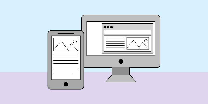
    The Internet is an essential resource for people worldwide. It provides access to information, entertainment, and services that make daily life easier. However, for people with disabilities, navigating the web can be a daunting task. That’s where assistive technology comes in. They help to bridge the gap and make the web more accessible for everyone.

    So, what does your online business need to know about assistive technologies, and how can you make sure your website is compatible? In this post, we’ll break down the following:

    • What Is Assistive Technology?
    • What are 5 Types of Assistive Technology Tools?
    • How Can I Make My Website Accessible?

    What Is Assistive Technology?

    Assistive technology(AT) is any tool or device that helps individuals with disabilities to access, navigate, and interact with web content. These tools can be hardware or software solutions that make it easier for people with various impairments to access and use websites and other digital resources. For example, a switch device using blinking or tapping can replace the need for a keyboard or mouse.

    Typically, four main types of disabilities need to be considered.

    • Visual: People who are blind, have low vision, or are color blind.
    • Auditory: People who are hard of hearing or deaf.
    • Motor: People who have limited fine motor control, muscle slowness, or tremors and spasms
    • Cognitive: Cognitive disabilities hinder the behavior and intellectual development of a person. This includes a broad range of disabilities, from mental illnesses to learning disabilities or old age.

    Different types of ATs are built to help each of these groups access web content. These tools are designed to bridge the gap between the users’ abilities and the demands of websites, making the web more accessible and inclusive.

    What are 5 Types of Assistive Technology Tools?

    With so many different types of assistive technology, it can be challenging to know where to start. So here are five of the most common types and how they help support people with disabilities browse the web:

    1. Screen Magnification Software

    Did you know that over 200 million people worldwide have a visual impairment that makes it difficult to read standard-sized text on a screen? Users with low vision often rely on magnification tools, such as screen magnifiers or browser zoom features, to make content legible or to reduce eye strain.

    Most web browsers can “zoom in” on content, but screen magnification software works differently. Tools like MAGic, Windows Magnifier, and Apple’s Zoom magnify a part of the screen at a time, preserving the web page’s layout.

    However, many users prefer to use the zoom function on their browsers. So don’t assume anyone with a visual impairment will only use screen magnification software when accessing your website.

    The Web Content Accessibility Guidelines (WCAG) are a set of intentionally shared standards for website accessibility. For example, WCAG’s “Resize Text” guideline requires content to be zoomed in at least 200% before losing content or functionality. 

    2. Screen Readers

    Screen readers are essential for users who are blind or have severe visual impairments. These software programs convert on-screen text into spoken words or braille output. As a result, users can navigate and interact with your website using only auditory feedback.

    Popular screen readers include JAWS (Job Access With Speech), NVDA (NonVisual Desktop Access), and VoiceOver (for Apple devices). Each screen reader has its capabilities and limitations for carrying out tasks. However, screen readers only work if websites are compliant.

    Here are a few examples of WCAG guidelines that are essential for screen readers:

    • Providing all non-text content (images, form fields, video, audio, etc.) with alternative text descriptions. For example, images should have a text description that explains the image’s purpose on the page.
    • Websites should use clear, descriptive headings and labels.
    • Websites can be navigated with a keyboard or an alternate keyboard only.


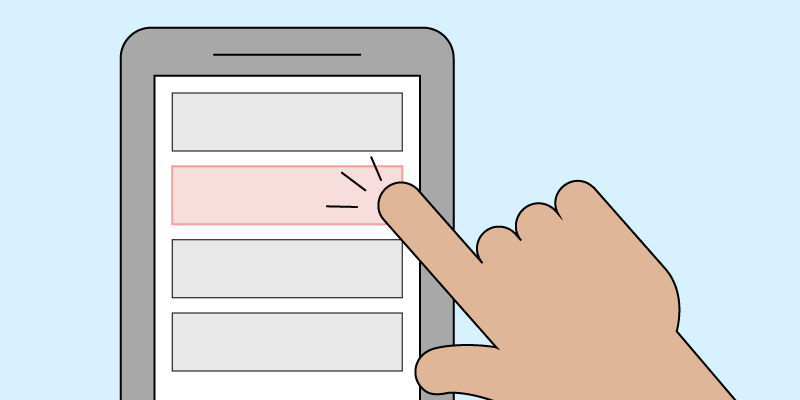
    3. Voice Recognition

    One of the growing advances in AT is voice recognition. Voice recognition technology lets users control their browsers, dictate text, and interact with websites using only their voices. By enabling voice commands, users can navigate, click on links, fill out forms, and perform other tasks without using their hands.

    Users should be able to use common commands such as “go to the homepage” to operate websites in predictable ways. However, web content must be designed and coded for users to use voice recognition tools.

    Here are a few WCAG guidelines that can help improve the browsing experience for speech recognition users:

    • Provide users with a clear visual indicator of which element is the current focus. Without focus indicators, users might not know what they’re controlling.
    • Use labels and identifiers for interactive elements. Each element’s programmatic label should match its visual presentation. For instance, if a user sees a “submit” button on a page form, they should be able to say “submit” to activate the control and complete the form.
    • Remove any keyboard traps that would prevent users from navigating your site after focusing on a certain element.


    4. Switch Devices

    A switch device is a specialized input tool that replaces the need for a keyboard or mouse. It is used by people with physical disabilities or fine motor impairments to access and control computers, smartphones, and other communication devices.

    However, switch devices vary based on the user’s mobility, preferences, and settings. This can include pressing a button, blowing into a tube, or even moving an eyebrow. For example, users can press a large, round button with their hand, foot, or whatever is most comfortable. Then, on the screen, a focus indicator will automatically cycle through different elements on the site, and the user can click to activate the switch.

    Like voice recognition AT, switch devices require similar WCAG standards to be implemented on a website for users to engage in the content.

    5. Closed Captioning Services

    Most of us are more familiar with closed captions, from streaming services and YouTube to video calls with Zoom. However, although it’s one of the more popular ATs, it is often overlooked.

    Closed captioning services provide on-screen text corresponding to video and multimedia presentations’ audio content. By providing accurate and synchronized text captions for your multimedia content, you’re allowing users who are deaf or hard of hearing to understand and engage with your website. For this reason, WCAG requires all pre-recorded audio content to be clearly labeled, except for media with an alternative text option. 

    However, while automatic caption tools are available, they are far from perfect. For instance, we have all watched a YouTube video where captions do not always align with the speaker’s words. If it was not for our ability to hear, the message’s meaning would be different based on what the auto caption filled in. Therefore, it is highly recommended to use closed captioning services that employ human transcribers to make captions and transcripts more accurate.

    How Can I Make My Website More Accessible?

    With so many different types of AT available, it can be hard to know where to start. But regardless of where you are on your accessibility journey, we’re here to help. At 216digital, we can help develop a strategy to integrate WCAG 2.1 compliance into your development roadmap on your terms. Providing an accessible browsing experience to all your users, including those with disabilities.

    To learn more about how the ADA experts at 216digital can help build an ADA WCAG 2.1 compliance strategy to achieve ongoing, real-world accessibility on your terms, schedule an ADA Strategy Briefing.

    Greg McNeil

    April 28, 2023
    216digital, ADA Web Accessibility, Uncategorized
    Accessibility, ADA Compliance, ADA Website Compliance, Website Accessibility
  • What to Expect from WCAG 2.2

    What to Expect from WCAG 2.2

    Are you an online business or website owner? If so, you must be aware of the critical changes in the  Web Content Accessibility Guidelines (WCAG) 2.2! The World Wide Web Consortium (W3C) is expected to release the latest version of WCAG in May 2023. So stay ahead of the curve and ensure your website remains accessible to all users, including those with disabilities. Here’s what you need to know about the proposed changes — and how they will affect your current WCAG compliance. And remember, when WCAG 2.2 goes live, 216digital will be here to help.

    Why is WCAG Changing?

    WCAG is a set of guidelines designed to help make web content more accessible to people with disabilities. However, as technology and user preferences change, so must WCAG’s standards. Each new standard introduced is developed by the Web Accessibility Initiative (WAI). In 2021, WAI announced they were starting to work on the draft for WCAG 2.2, which is finally expected to be released sometime next month.

    WCAG can be changed to add new success criteria or to change a current guideline’s conformance level. But, it will not remove any guidelines or change any language. Currently, WCAG 2.2 is based on the same three conformance levels as the previous versions: Level A, AA, and AAA.

    Level A

    Level A is the lowest level of conformance and the easiest to achieve with minimal impact on a website’s structure or design. It allows websites to be broadly accessible as it addresses the most basic access issues.

    Level AA 

    By meeting the success criteria for Level AA, websites are considered reasonably accessible as they offer a higher level of conformity than Level A. AA is most often used as the compliance standard in lawsuits and is usable for most people.

    Level AAA

    Level AAA is the highest level of conformance and the most difficult to achieve. It is not often used as a goal to strive toward since it is not feasible for most websites to have the resources to meet this level.

    What’s Changing In WCAG 2.2?

    WCAG 2.2 introduces nine new success criteria along with minor changes to the instructions accompanying several established guidelines. However, each of these criteria is still up for feedback and changes, so there’s no guarantee that all of them will make it into the final version of WCAG 2.2.

    Here’s a quick overview of the new guidelines — and how each one can help address web accessibility issues:

    Guideline 2.4 Navigable

    2.4.11 Focus Appearance (Minimum)

    Level AA

    Focus Appearance builds on two existing WCAG criteria, specifying the minimum requirements for focus indicators. The new guideline ensures that keyboard focus indicators are visible and easily distinguishable. They must have a clear border, are not obscured by other content, and have at least a color contrast ratio of 3:1 against the unfocused state and all adjacent colors.

    The intent of WCAG 2.4.11  is to help low-vision users who use a keyboard for navigation. Users can quickly tell where they are on a page by ensuring the current focus point is visible.

    2.4.12 Focus Not Obscured (Minimum)

    Level AA

    Knowing the current focus point is essential for sighted users who use a keyboard or keyboard-like device. However, sticky headers, pop-ups, and other content can sometimes obscure focused elements while a user is browsing.

    However, Criterion 2.4.12 requires user interface components not to be entirely hidden from other content on the page. This lets users easily track the current focus point and avoid confusion.

    2.4.13 Focus Not Obscured (Enhanced)

    Level AAA

    Similar to 2.4.12, 2.4.13 requires that no part of the focus indicator is hidden by other content.

    Guideline 2.5 Input Modalities

    2.5.7 Dragging Movements

    Level AA

    Drag and drop movements can be difficult and error-prone for many website users. Therefore, WCAG 2.5.7 requires that any functionality that uses a dragging movement for operation can also be achieved in other ways, like clicking. For example, a user could use a single tap, double tap, long presses, or path-based gestures instead of dragging an item. However, a dragging action is allowed when it is essential to the functionality of the content.

    2.5.8 Target Size (Minimum)

    Level AA

    When buttons and other clickable elements are small, they can be challenging to interact with for people with fine motor impairments. The purpose of 2.5.8 is to ensure that when users select a target with a mouse or other device, they can do so easily without activating other nearby targets. Therefore, all clickable elements, such as links, must be at least 24 by 24 CSS pixels in size and spacing between adjacent targets.

    2.5.8 provides a level AA alternative to 2.5.5: Target Size (Enhanced), which was introduced as part of WCAG 2.1. However, 2.5.5 requires the target size for all clickable elements to be at least 44 by 44 CSS pixels.

    Guideline 3.2 Predictable

    3.2.6: Consistent Help

    Level A

    The goal of 3.2.6 is to ensure that all users can easily find help when completing tasks on a web page. For example, suppose a help feature — such as search bars and help buttons — is available on multiple pages of a website. In that case, it must appear in the same relative place an order on each of the pages where it appears. This is particularly beneficial for users with cognitive disabilities or limited web experience, as they can quickly access help when needed.

    Guideline 3.3 Input Assistance

    3.3.7 Redundant Entry

    Level A

    For people with cognitive disabilities, logging into a website or mobile app can be challenging. The 3.3.7  level AA guideline tackles authentication processes that require the user to remember, manipulate, or transcribe information. Websites that use cognitive function tests must provide at least one other authentication method.

    For instance, asking users to remember a password is a standard cognitive function test. But suppose the website allows entries from password manager browser extensions. In that case, the website has provided them with a mechanism to complete the process.

    3.3.8 Accessible Authentication (Minimum)

    Level AA

    3.3.8 takes 3.37 further by not allowing any exceptions for cognitive function tests. For multi-step processes, 3.3.8 requires websites to auto-populate fields or enable users to select the information that they’ve previously entered. For example, suppose a website’s form requires the user to enter their address multiple times. In that case, the second field should either provide users with an option to select their address from the previous entry or auto-populate.

    3.3.9: Redundant Entry ( Enhanced)

    Level AAA

    Similar to 3.3.7 and 3.3.8, 3.3.9 applies to the authentication process. However, 3.3.9 is a Level AAA guideline that does not require an authentication process unless that step provides an alternative authentication process or auto-populate.

    Getting Ready for WCAG 2.2

    While the full implementation of WCAG 2.2 may still be on the horizon, it’s never too early to start preparing. Here are some steps you can take to ensure a smooth transition:

    1. Familiarize yourself with the new success criteria and understand their implications for your website.
    2. Conduct an accessibility audit to identify areas that need improvement and align with WCAG 2.2 requirements.
    3. Update your website’s design, content, and functionality to address the new criteria and improve accessibility.
    4. Train your team on the importance of web accessibility and the new guidelines to ensure consistent implementation.

    How Will the Revisions Affect My Current WCAG Compliance?

    The transition from WCAG 2.1 to 2.2 will require some adjustments to your website, particularly in the areas of navigability, input modalities, predictability, and input assistance. However, these updates are designed to build upon the existing guidelines, so your current efforts will not be wasted. By proactively addressing these changes, you’ll ensure that your website remains compliant and accessible to all users.

    When WCAG 2.2 Goes Live, We’ll Be Here to Help

    When WCAG 2.2 goes live, you can count on  216digital to help you navigate the changes and maintain an accessible website. Our expert team will assess your website, provide recommendations, and implement the necessary adjustments to ensure your website meets the latest accessibility standards. Reach out to us today by scheduling a complementary ADA Strategy Briefing so that you can embrace the future of web accessibility with confidence.

    Greg McNeil

    April 28, 2023
    216digital, ADA Compliance, ADA Web Accessibility, Uncategorized
    Accessibility, ADA Compliance, ADA Website Compliance, WCAG, WCAG 2.2, Website Accessibility
  • Retail is the Prime Target for ADA Web Accessibility Lawsuits

    Retail is the Prime Target for ADA Web Accessibility Lawsuits

    Today, almost everyone is shopping online. Consumers expect the ability to browse, compare and shop from any device rapidly. However, as more consumers shift to online shopping, retailers face increasing legal challenges for failing to meet minimum standards for ADA web accessibility.

    The Americans with Disabilities Act (ADA) requires that all public-facing digital content be accessible to people with disabilities. Failure to comply with the ADA web accessibility guidelines can result in legal action, settlement costs, and reputational damage. In this article, we’ll explore why retail is the number one industry targeted by ADA web accessibility lawsuits and what you can do to protect your online business.

    What is Web Accessibility for Retail

    Web Accessibility is about creating an inclusive experience for all customers with barrier-free access to your online store. Websites must allow customers with visual, auditory, physical, and cognitive disabilities to access information, make purchases, and interact with your online business. 

    However, customers with disabilities can have vastly different experiences on a website based on their disability and the assistive technologies used. For example, customers with mild-to-moderate vision may rely on their browser’s built-in zoom function. In contrast, customers with more severe visual impairments require a screen reader to access information, browse your products, and shop. But how does web accessibility affect retail business owners? 

    Key Insights Retailers Need to Know

    In recent years, there has been a sharp increase in lawsuits related to website accessibility, and retailers have been among the hardest hit. In 2022, there were more than 4,000 web accessibility lawsuits filed in Federal and California State Court under the Unruh Act. However, the retail industry was the number one industry targeted by ADA web accessibility lawsuits, accounting for almost 77%.

    In fact, 391 of the Internet Retailer Top 500 list received an ADA-based web accessibility lawsuit within the last five years. Likewise, 72% of cases filed in 2022 were against companies with less than 50 million annual revenue. For large and small eCommerce companies, web accessibility is critical as consumers and plaintiffs become more aware of their rights under the ADA and seek legal recourse. 

    For more information on recent ADA web accessibility filings, check out Accessibility.com’s Digital Accessibility Lawsuits Database.

    Why Are Retailers Vulnerable?

    With the rise of e-commerce, online retailers face increasing web accessibility lawsuits. But why? Are retail sites less accessible than other industries?

    Large Online Presence

    Online retailers are everywhere! With more and more eCommerce websites created daily, there are 24 billion estimated globally. Undoubtedly, the retail industry has the most prominent digital presence, making them easy to find and visit. 

    As a result, e-commerce stores can quickly become victims of frivolous ADA-based lawsuits. Plaintiffs can quickly surf the web, engage with products or information, and determine whether a company prioritizes web accessibility. 

    Complex Websites Can Be Difficult to Make Accessible

    It can be challenging for retail sites to reach and maintain the international standards for web accessibility,  Web Content Accessibility Guidelines (WCAG). E-commerce stores are notoriously complex, with many pages, dynamic content, and intricate navigation. Making such websites accessible to individuals with disabilities can be a daunting task. In addition, it can present financial and logistical challenges, especially in a constantly evolving industry.

    Many online retailers may not have the resources to hire web developers with expertise in ADA compliance or keep up with the constantly evolving standards and guidelines for web accessibility, increasing their vulnerability to litigation.

    A Constantly Changing Industry

    Online retailers frequently update their content to inform customers about new products, services, promotional sales, and resources. However, these changes can also make it more challenging to ensure the website remains accessible. Unfortunately, creating an accessibility barrier for disabled users is almost too easy.  

    Retailers must stay vigilant and up-to-date with web accessibility standards and guidelines. Failure to do so can leave retailers vulnerable to an ADA web accessibility lawsuit. Plaintiffs can easily find web accessibility barriers, document them, and file an ADA lawsuit, frequently creating a vicious cycle.

    Easy to Test for ADA Web Accessibility

    Most retail websites have the same or similar accessibility barriers. This can make it relatively easy for plaintiffs to test websites using automated tools and target many websites simultaneously. Automated tools can quickly scan a website and identify potential accessibility barriers based on the WCAG 2.1 guidelines, such as missing alt text, improper header structures, and broken links.

    This means plaintiffs can quickly and easily identify accessibility issues and file ADA web accessibility lawsuits against retailers in minutes. In contrast, website owners are left spending thousands on settlement costs and website remediation. Retailers must take the necessary steps to ensure ADA web accessibility compliance to minimize the risk of litigation.

    Existing Department of Justice Settlements

    The US Department of Justice has settled several high-profile ADA web accessibility lawsuits with retailers, including Winn-Dixie and Walmart. These settlements have resulted in significant financial penalties and required these retailers to take extensive measures to make their websites more accessible.

    As a result, these settlements have set a precedent for other plaintiffs now targeting retailers with similar accessibility issues. They can directly reference past DOJ actions within their case. Retailers must be aware of these settlements and ensure their website is accessible to all customers.

    Quick Settlements

    Plaintiffs’ attorneys often target online retailers for ADA web accessibility lawsuits because they are settled quickly and relatively easily. This is because online retailers usually prefer to pay out of court rather than go to trial, as they can avoid additional costs and negative publicity associated with a lengthy legal battle. As a result, plaintiffs’ attorneys can often secure quick settlements, making it a lucrative and attractive option to target online retailers.

    How to Protect Your Online Business

    It is essential to ensure that your website and online applications comply with ADA web accessibility standards to mitigate the chance of a lawsuit. This may involve working with web accessibility experts to conduct an audit and any necessary changes.

    To protect against ADA web accessibility lawsuits, retail companies should take several steps:

    1. Conduct a web accessibility audit: Conduct a comprehensive web accessibility audit to identify all web accessibility barriers.
    2. Make a plan: Address the issues identified in the audit, prioritizing the most critical issues first.
    3. Train staff: Educate staff on web accessibility best practices and how to maintain accessibility standards moving forward.
    4. Use accessibility tools: Use accessibility tools, such as web accessibility monitoring services, to test websites and apps for accessibility.
    5. Consider a dedicated accessibility team: Partner with an accessibility team to oversee ongoing web accessibility efforts and ensure compliance with ADA requirements.
    6. Stay up-to-date: Stay informed about ADA web accessibility requirements, and update websites and apps as needed.

    Get Proactive about ADA Web Accessibility

    Everyone, especially those in the online retail industry, should be proactive about ADA web accessibility. By taking proactive steps to ensure the accessibility of your website, you can mitigate legal challenges and provide easy access to all customers.

    Through our years of experience in the trenches analyzing and studying these cases, we can determine how ADA non-compliance lawsuit firms identify their targets and how to protect your business. At 216digital, we will develop a strategy to integrate WCAG 2.1 compliance into your development roadmap on your terms so that you can focus on the other tasks on your to-do list. So don’t wait any longer; find out where you stand by scheduling a complementary ADA Strategy Briefing today.

    Greg McNeil

    February 28, 2023
    216digital, ADA Web Accessibility, Uncategorized
    Accessibility, ADA Compliance, ADA Website Compliance, Website Accessibility
  • The Small Business Marketing Guide to Surviving COVID-19

    The Small Business Marketing Guide to Surviving COVID-19

    The coronavirus (COVID-19) has been a drastic agent of change across the globe. It’s forced us to adapt how we live and work to the new pandemic environment.

    If things go right and we flatten the coronavirus curve, we could be social distancing for quite a while. Already, this has put many small businesses in a difficult position, especially those that rely on in-store purchases.

    It’s important to work together during this time. So, to help other small businesses, we’re sharing this guide to digital marketing during COVID-19. By improving your business’ presence on the internet, not only can you endure the pandemic, but build the foundation for success when it ends.

    (more…)

    Greg McNeil

    April 17, 2020
    216digital, Applied Ecommerce, Digital Marketing, SEO, Uncategorized, Web Design
    Coronavirus, COVID-19, Digital Marketing, ecommerce website, SEO
  • Simplicity is Key to Conversions: User Experience (UX) Produces Profit

    Simplicity is Key to Conversions: User Experience (UX) Produces Profit

    Our brains are handling a lot right now. Processing work, making plans for the weekend, reminding you to breathe. You clearly have a lot on your plate. When it comes to focus and cognitive thinking, however, as humans we operate a bit differently. The human brain is not an automated processor meant to produce output multiple times a minute. Automated problem solving vs. logic and reasoning are what separate man from machine. We prefer to take on one small task at a time, solve it, process what we learned and move on to the next. The more practical the process, the easier it is for us. It is much more efficient than juggling multiple balls in the air at once. Keep it simple.

    Websites and eCommerce stores are no different. Simplistic design and rational navigation will always crank out the most conversions because these factors make sense to our brains. The structure is tailored towards the user. It helps define the overall experience for them and that is a crucial ranking factor with Google. Believe me, they will notice. Social Media Cleveland

    Guiding visitors towards the conversion funnel isn’t tricky marketing or a psychological sales trigger. It is just common sense. In fact, most users will expect some sort of assistance leading them through the process, especially the checkout. ECommerce developers know this, which is why the structure or layout of a site is one of many factors in the world of user experience or UX as it is commonly called.

    What Makes Up User Experience

    At its core, user experience (UX) is simply making the experience of the user, a pleasant one. That’s you. Whether you realize it or not, the structure, the placement, the ease of checkout and any other things related to the function of the site is designed for you. Let’s break down UX to some of its core features and discuss how a website can work with you to meet your goals. There are multiple factors that help a site function and most importantly, help you succeed. Some of the most common features that assist the user conversions include:

    • The site’s navigation
    • The site’s visual design
    • The site’s technical optimization
    • The site’s content

    Here’s how each of these features makes your life easier and serve a purpose on a website.

    Findability

    When navigating a site, the easier it is to find what you are looking for, the better. Part of the reason is the conversion process. If you are looking to purchase something or submit a form, all signs should point to this. Users should not have to use a search toolbar to see products or checkout. Most eventually will get bored or frustrated and leave the page. This can lead to an ever-climbing bounce rate as you find more and more users navigating away. Make sure your menu or toolbar is practical and the placement of the pages makes sense. A website with a sensible layout can lead to maximum conversions.

    Visibility

    Cleveland SEO servicesA site should absolutely be relatable and appealing. The aesthetic design should pull users and make them want to stay. The main toolbar should be eye-catching and draw the user to it. The best placement for the main navigation center is in the header or above the fold of the page. Most successful sites have their main features in this area, such as the blog, the cart or main login area.

    It is often said “less is more” and the same is true of a website layout. In the digital age, the content should be compact and precise. Avoid lengthy paragraphs that would prevent a user from reading the entire post and break up information into more manageable pieces. Use bullets, logos, shorter lines and visual aids to draw the reader through the content. Also, be sure to include interactive buttons, hyperlinks or images that will keep your users stimulated. If it looks pretty, they are going to want to click on it.

    Usability

    A website has many visitors but they aren’t always human users. It is crucial to remember the robots are watching too. For a site to function properly, there are a number of technical optimization tools to use that will get you into the rankings. Things like SEO, page speed, image alt tags and mobile friendliness will earn you bonus points with the robots. In fact, some of these features are an absolute must with the Google algorithm updates. Missing any one of them could cost you rankings and site traffic.

    Avoid the penalties and do your research. Get quality SEO keywords in your content and update it often. It is also vital that your site has an app that caches page content. This will dramatically decrease your load time, which the search engine robots will like. Humans will like it too.

    Likability

    One of the most challenging tactics to conquer is the site’s content. In order for a user to interact with your site and come backDigital Marketing often, you have to have some sort of draw. Users have to like being there. Having quality images and technical cues are great, but at the end of the day, the users are reading your content. If it isn’t engaging or the content is difficult to follow, most users will leave. Some key things to remember in your content, along with optimizing for the search engines, are your style and voice. These should appeal to your audience, in addition to your topic choices. Never talk down to visitors or become too “preachy” in your delivery.

    Also, do some marketing trends research. See what people are talking about and join the conversation. It is just as much your responsibility to be entertaining as to be informative. This will help build your audience and most importantly, keep them coming back for more. Focus on digital campaigns and enhancing your visibility.

    **

    For those looking for assistance with digital marketing campaigns and enhancing visibility, 216digital offers Cleveland SEO services to help you with your rankings. We also offer Cleveland web development and digital marketing assistance. Let us help you build your brand and become successful. We are eCommerce developers with a passion to be creative and a drive to help you succeed. Contact us for help with Miva design or if you have been considering Miva developers for your website.


    Greg McNeil

    August 21, 2018
    216digital, Content Marketing, Digital Marketing, SEO, Social Media Marketing, Uncategorized
    Digital Marketing, SEO, User Experience, UX
  • 8 Features of Excellent Websites in 2017

    8 Features of Excellent Websites in 2017

    By now many of us have earned our stripes in web surfing. We’ve experienced a countless number of websites, and are savvy enough to know which sites are well crafted and which could use a serious face-lift – usually within the first five seconds of a visit. But what is it that makes a website “great?” Below are eight features many high-performing websites currently employ that put them at the top of their rank.

    1. High Quality, Authentic Images

    Humans are visual creatures. Think back to the last time you sat through a presentation where the speaker went on for seemingly forever without any graphics or visuals to break through the monotony. You may have absorbed some of the information, but chances are you walked away without having gained anything more than a headache.

    This same principle applies to websites. Throw large columns of text at a user when they’re not expecting it (i.e. not a blog post) and they will leave your site without even a basic understanding of what you were trying to communicate. Studies show that users only read about 28% of the words on a page. Add that in with the fact that humans process images 60,000 times faster than words, and the best way to quickly express a message becomes obvious.

    Not just any image will do, however. The best performing images for a website follow a few guiding rules:

    • High Quality: With faster internet speeds comes more capability of loading high resolution images. Low quality, pixilated imagery will make your site appear dated and untrustworthy.
    • Authentic: Gone are the days when users would be appeased by staged stock images of smiling business people shaking hands. We know they’re fake, your users know they’re fake, and they no longer represent real businesses made of real people. It’s recommended to use images of your own team, office, and products to boost authenticity.
    • Closely Related: That beautiful image of a sprawling scenic overlook may be eye catching, but if it doesn’t do much to describe what you’re selling, it won’t be an effective use of browser real estate. Images on your website should be companions to your content and remind users why they’re there.

    2. Consistent Brand Voice

    Computer Screen With A Hello Speech Bubble.

    Though not limited to website design, a well thought-out brand voice is an important part of engaging users. All of your content on your website should follow the tone of your brand and reflect the core values of your business. Users will come to recognize your brand by various factors:

    • Tone: How do you want to communicate with your users? Consider your audience and the way that they use your site. For example, a financial institution may want to use a tone of voice that comes across as being professional and cordial, whereas a toy store can speak more whimsically.
    • Buzzwords: What kind of language will resonate best with your users? The types of words you might use for a gym will differ greatly from those used for a spa. Think of the types of keywords a user might search for, or what will draw them in.
    • Conciseness: How quickly should the user be taking in your content? If you want to draw your viewers in with a well-crafted aesthetic, you may need to pad your copy with the appropriate amount of wordage to paint the right picture. However, if you want your users to quickly flow through your site and into a purchase or action, you’ll want to keep your copy short and sweet.

    Once you have your brand voice, be sure to keep it consistent on every page of your site. This will keep your business recognizable and put users at ease.

    3. Fast Loading Times

    Loading Progress Bar.

    Have you ever clicked on a link to a website and hit the back button in frustration when it took too long to load? Users today have grown accustomed to fast load times and don’t want to wait. About 50% of all web users expect a web page to load in 2 seconds or less, and 40% will completely abandon the attempt after 3 seconds.

    This means that if your website is slow to load, you will only be gaining at maximum 60% of the traffic that you could get. There are many factors when considering the speed of your website:

    • Image sizes: Remember those high quality images we talked about? Unfortunately, images can have large file sizes that will bog down the performance of your site. Consider keeping the number of images on your site down to raise site speed, or use a program to optimize their size.
    • Hosting: Your site speed may be completely out of your hands if you’ve chosen an inexpensive hosting plan. Though cheap, oftentimes you are sharing a server with many other money-conscious business owners, which will slow down your site’s performance. If it’s your hosting that’s the issue, consider upping your plan.
    • Optimization: There are several ways to improve your site’s overall speed from the backend; too many to name here. If your site is slow, consider asking a web developer to optimize all of your settings.

    4. Simple Navigation

    Web Browser Showing A Generic Website Layout.

    Have you ever gone to a store for something basic like toothpaste and been completely overwhelmed by the number of choices you have to pick from? Suddenly, a simple errand has turned into a confusing situation. Users feel the same about website navigation; give them too many choices and they will give up and leave.

    This phenomenon, called the paradox of choice, deems that the more options presented to us, the more likely we are to become overwhelmed and not pick anything at all. In web design, 7 navigation links is generally considered the maximum number to hold, with 5 being the more optimal number. When choosing navigation links for your site, consider the purpose of your website and which ones would be absolutely necessary for a user to have a positive experience. If your site is very large and requires a multitude of navigation items, consider using a mega menu.

    5. Mobile First

    Mobile Phone Next To A Computer Monitor.

    Mobile-friendly websites are no longer a nice feature to have in 2017; they’re absolutely necessary. More people are browsing the web on mobile devices than desktops, pulling in at a ratio of about 56:44. This means that if you’re not catering to your mobile audience, you’re missing out on over half of your potential!

    Creating a great mobile experience is more than just having a responsive website, however. Mobile first design means exactly what it sounds like. Rather than designing based on a desktop monitor and shrinking it down for mobile, modern websites are now being designed first for mobile to create the best possible experience. Some factors that make mobile an entirely different medium from desktop:

    • Screen ratio: Many phones and tablets are designed to be held horizontally by default, meaning the screen size sits at a completely different ratio than most Desktop monitors. Side-by-side columns on desktop screens become far too narrow on mobile devices. Simply stacking the columns on top of each other for mobile is not the best solution either. After all, which column is more important/should be on top? Mobile first design addresses this issue before it even arises.
    • Screen size: Mobile devices have far less screen real estate than desktop monitors. Thus, making a desktop first design and paring it down for mobile often becomes a task of cutting out content that isn’t necessary. Mobile first design forces designers to first consider what is important for the user to have, preventing unnecessary content in your desktop view.
    • Touch interaction: Unlike most desktop monitors, mobile devices can be tapped and pinched, adding another dimension to the user’s experience. Rather than adding these features as an afterthought, mobile first design ensures that the entirety of the site is easily accessible to mobile users.

    6. Engaging Micro Interactions

    Website On A Tablet Showing A Section That Changes Color To Show It Was Clicked.

    Micro interactions are those little experiences we encounter on the web that serve a single purpose, such as a checkmark showing us that we filled in a form field correctly, or a confirmation that an order went through. These interactions are so common now that most of us barely take notice, but their effectiveness is anything but miniscule.

    Micro interactions serve to delight, engage, and deliver positive reinforcement to users to let them know that they’re performing the correct actions. Imagine hitting “send” in an email app and not receiving any indication that the button had been clicked or the email had been sent. How can you be sure that your email went out? Small indicators, such as the button changing color when clicked, the browser sending you out of your draft and into your inbox, or a notification alerting you that your mail has been sent tells the user that they have done everything correctly and that their job is done. Other examples of micro interactions include:

    • Play buttons turning into pause buttons when clicked
    • Form fields highlighting with a colored border when clicked
    • Load animations indicating that content is being loaded
    • Links changing color when hovered over to indicate that they can be clicked

    7. Frictionless (In the Right Places)

    Generic Website Showing A Product Page With A Buy Now Call To Action.

    Friction in web design refers to anything that stands between a user and their desired action. For example, a multi-page form before ordering a product, or a pop-up intrusion when reading an article. Generally speaking, friction on a website is frustrating for users and can drastically reduce conversion rates. Web users are in a hurry and want to consume content quickly – why stop them from doing what they came to your site to accomplish? Friction can be reduced in multiple ways, including:

    • Reducing the number of form inputs. Do you really need to ask for a user’s phone number, middle name, etc?
    • Clear call to actions. Users don’t want to have to search all over your website to find what they’re looking for. Identify what users most want to accomplish on your site and make it easy for them to access.
    • Make your header sticky. Users are now used to scrolling, however it can be frustrating to have to scroll all the way back to the top of a page just to access the navigation. Keep your header always in view for easy, seamless navigation.

    Though friction prevents users from doing what they want, it is not necessarily always a bad thing; in fact, there are times when you want to add friction to create a better experience, as it makes users stop and think. Experienced web designers know when to apply the brakes on a user’s journey, such as making a user confirm before deleting something. Accidental clicks are a real occurrence, so asking a user if they’re sure they want to delete something before it disappears for good can prevent frustrating experiences.

    8. Expert Usage of Color

    Color Wheel Showing Red, Orange, Yellow, Green, Blue And Purple.

    Have you ever wondered why so many fast-food restaurants use red and yellow for their logos, or why so many businesses paint everything with blue? Design isn’t just about making things look nice; a good designer understands the psychology of color and how best to employ them on a website. Each color can evoke an emotion from users. (Keep in mind that these meanings can vary from culture to culture.)

    • Red: The color of passion and aggression, red is full of energy and can evoke a sense of urgency.
    • Orange: This color is a mixture of red’s passion and yellow’s optimism, creating an upbeat hue that expresses playfulness. It is also the color of impulse, and thus is often used in “buy now” buttons.
    • Yellow: Bright and fun, yellow expresses happiness, sunlight, and a cheery tone.
    • Green: The color of both money and the earth, green is used to express wealth and environmental consciousness.
    • Blue: This color evokes trustworthiness and professionalism, making it an excellent choice for many businesses. However, blue can also express sadness and moodiness, so be careful.
    • Purple: Wisdom and royalty come to mind with purple, making it a good choice for businesses that want to express reverence or knowledge.
    • Black: Though not technically a color, black evokes luxury, making it excellent for expressing wealth.

    In Conclusion

    Though none of the features listed above are absolutely necessary to craft a high-performing website (I’m looking at you, Craigslist), they are important to keep in mind when considering the performance of your own site. If your numbers are down or you’re looking into a redesign, keep these tips in mind and you’ll be well on your way to an excellent website in 2017.

    Sources

    • Do Visuals Really Trump Text?
    • How Loading Time Affects Your Bottom Line
    • The paradox of choice and how it affects web design

    Greg McNeil

    September 18, 2017
    Responsive, Uncategorized, Web Design
  • Google AdWords Sitelinks: What Advertisers Should Know About the New Update

    Google AdWords Sitelinks: What Advertisers Should Know About the New Update
    Recently, Google launched a new update to their AdWords Sitelinks, doubling up on the previous limit of four links to give users more relevant options when searching. This update also grants advertisers more real estate to direct users to other pages on their sites. Following the traditional carousal format, these eight links will appear side-by-side when viewed on mobile or tablet; allowing users to easily swipe through sitelinks to find what they’re looking for. Image of Google Sitelinks

    So why the change?

    This new update seems to be following Google’s trend of placing greater focus on enhancing users’ mobile experience. From 2015 to 2017 alone mobile’s share of digital ecommerce has risen almost 12%. And with young shoppers increasingly choosing to make purchases directly on their mobile devices that number is expected to nearly double. This means that pay-per-click advertisers now have new and growing opportunities to market their ads to mobile users. How will it affect your bidding for mobile and tablets? Not having any luck with PPC? Contact us today for a free PPC audit.

    Sources

    • U.S. mobile retail commerce sales as percentage of retail e-commerce sales from 2015 to 2020

    Greg McNeil

    September 1, 2017
    Uncategorized
  • The Necessity of Google AMP in the Mobile Age

    The Necessity of Google AMP in the Mobile Age

    In our last AMP article, we covered how Google’s Accelerated Mobile Pages work and how you can utilize them to help boost your mobile ecommerce.
    Since then, Google has continued to enhance its mobile user experience. Rolling out new AMP updates like AMP Bind, which allows internet retailers to create product pages with interactive elements for color and size selection. As well as giving Adwords users the ability to use AMP pages as landing pages for their ads.

    But that’s not all.

    The new AMP updates also utilize Google’s Brotli to reduce document sizes by a further 10% and compress images 50% more efficiently without a loss in quality.

    These additions, coupled with applications like AMP Lite – Google’s optimized version of AMP for users with a slower internet connection or a low-end smartphone – have allowed Google’s AMP pages to load nearly 30 times faster than their non-Amp counterparts.

    So why the focus on mobile pages?

    If you spend the majority of your time in an office – home or work – you may be used to conducting most of your online activity via a desktop. For the rest of the world, however, smartphones are king.

    Think about it.

    When was the last time you waited until you had access to a desktop to look up a restaurant or search the IMDB of an actor whose movie history you can’t remember?

    The joy of owning a mobile device is its near instantaneous access. You not only have the whole of the web at your fingers, but you can take it with you anywhere you go.

    Consider this:

    As of 2016, comScore Mobile Metrix® reports that Americans spend an average of 87 hours a month browsing the web on their smartphones, as opposed to the 34 hours they spend browsing on a desktop.

    Looking at places like the U.K., Italy, and Spain, the numbers are similar. Most people are accessing the web through their phones.

    But why?

    It’s simple – affordability.

    Many people don’t have the money to invest in both a phone and a computer, so they go with the more logical – usually cheaper – choice.

    And in developing countries with larger populations like Nigeria, China, Peru, and India, this distinction is even more noticeable.

    For example, in a study conducted by MIT, 620 out of 690 million internet users in China go online via a mobile device. That’s almost 90%!

    Following the Trend

    So what does this mean for the future of web pages?

    It’s hard to say. As smartphone technology continues to advance, the stripped down versions of AMP pages may change.

    However, as it stands now, that easy mobile access is key.

    Want to AMP up your page? Contact us today for a quote!

    Sources

    • Google brings expanded AMP support to search and display ads
    • Google’s AMP now powers 2B+ mobile pages and 900K domains, loads 2x faster
    • Bringing the speed of AMP to search & display ads
    • What’s coming for SEO in 2017? 5 hot SEO trends from the SMX East conference
    • AMP For Retailers: Is It Worth It?
    • World Wide Web, Not Wealthy Western Web (Part 1)
    • 31 Mobile Marketing Statistics to Help You Plan for 2017
    • Internet Mobile internet usage surpasses desktop usage for the first time in history

    Greg McNeil

    July 12, 2017
    Uncategorized
  • I Would Have Been A Terrible Doctor

    I Would Have Been A Terrible Doctor

    My father used to say, “Life’s what happens while you’re busy making plans.” Back then, I couldn’t appreciate how true that phrase really was. When I was growing up, I didn’t make very many plans. Driven mostly by impulses and a stockpile of assorted energy drinks, the only real plan I maintained was that, somehow, I would be a doctor. More specifically, I was to become a trauma surgeon.

    It wasn’t that I was in love with the work, or that I felt some need to be looked at as a hero. It just seemed like a real swell way to get paid. I suppose the inherent respect and prestige didn’t hurt either. So, I spent my adolescence applying myself just enough to maintain an excellent GPA and avoiding any trouble that might otherwise derail my plan.

    One day I returned home to welcome the newest addition to my family. Her name was Packard Bell. She was a blazing fast 90 megahertz Pentium powered PC boasting 16 megabytes of ram and running Windows 3.1. The seed had been planted. To this day, I can still vividly remember my frustrations when trying to run newer applications and instead being met with a fury inducing error message informing me that the application required a 32-bit environment.

    The internet changed everything. Long before broadband internet, BitTorrent, and NetFlix, there was America Online (AOL.) Back when internet usage was doled out in 30 hour trial discs and the mere act of connecting meant listening to a painful symphony of beeps and modem static, AOL was busy redefining how and why people used their personal computers.

    The first website I’d ever built was through “AOL Hometown”, a service which allowed AOL subscribers to create simple personal web pages by offering them a massive 12 megabytes of web hosting and an unintimidating wizard-driven page builder. At some point, I realized that you could connect separate pages together to form something greater using hyperlinks. The term web developer hadn’t yet grafted itself to our lexicons, so that day I became a “webmaster.”

    By high school, I found myself completely addicted to online gaming. You know you’ve got a problem when your dreams, (and nightmares,) are consistently set in your game world rather than the real one. I used to wake up a few hours early every morning just so I could get my fix before being carted off to school.

    I had never been overly athletic or popular. Let’s just say that my lunch table had plenty of unoccupied seats. Whereas most kids find their niche in some school-sponsored extracurricular or art, I felt most at home on the internet. Online gaming was becoming a much more social and organized pastime. Whether it was a team, a clan, or a guild, I always belonged to some collection of equally addicted individuals who sought to bring legitimacy to their hobby.

    One common approach was to establish a website and other infrastructure. On these occasions, I was thrilled by the chance to be seen as valuable. I could build a website. These frequent requests to develop a web presence for otherwise anonymous organizations gave me a reason to spend hours pouring over tutorials and guides which comprised my original education on the topic of web development.

    This was still well before anybody had ever heard of WordPress, and anything I built that wasn’t simply a static site typically relied upon an ancient sorcery known as PhpNuke. (Quite possibly the first widely used PHP content management system) I found myself learning something new after each site I built and I could tell that I was getting better at it, but this talent and curiosity wasn’t making me any money. I was still going to be a doctor.

    Eventually, it was time to go to college. Thank God I was given a full scholarship because a few months working at Blockbuster doesn’t quite cover tuition. I entered as a Biology/Pre-Medicine double major. Here I was finally working down the path that would ultimately lead to a PhD at the end of my name. The only problem was I absolutely loathed Biology.

    After a few weeks, it was clear that I wouldn’t survive several years following this track. This was a terrifying realization. For years, I had been introduced by my parents as their son Justin, who was going to be a doctor. I felt as though I’d forfeited my identity and my future. I scrambled to set my sights on some equally noteworthy alternative fate.

    It occurred to me that I enjoyed working with computers. I’d already demonstrated a gift with programming that set me apart from my peers. Perhaps this was what I was meant to do. (Or at the very least, it had to be a little easier than my previous ambitions.) So after one semester, I converted into a Computer Science major and set to work trying to determine how that would translate into a worthwhile career.

    At the time, students interested in programming could follow one of two tracks: software development or web development. I’d grown fascinated with the internet over the years, so it seemed like an easy decision. My coursework focused more heavily on software development through traditional languages like C+ though, so I was left to teach myself the skills I needed to be productive as a web developer.

    I’ll always be grateful for the hundreds of tutorials and articles that introduced new techniques, technologies, and concepts to me in a very approachable way. If it weren’t for these tremendous resources, I don’t know where I’d be now. Hopefully I’ll be able to contribute some of my own in the near future to give back to a community that has given me so much.

    My first few years were spent freelancing alongside my day job as a bill collector for General Electric. I think GE preferred the title “Collections Associate” or “Account Representative”, but the customers had much more creative and far less dignified names for us. It was by far the least enjoyable and most soul-crushing occupation I’ve ever held and was a fantastic motivator for me to find a more fulfilling livelihood.

    Freelance opportunities were somewhat scarce, but I knew that I was going to need some relevant experience in order to get a job doing what I wanted to do. So I took on any gig that would help put notches in my belt and a few dollars to my PayPal account. Most of the work centered around building or updating dinky little websites for local businesses. It didn’t make me rich, but it did help keep me focused on landing a meaningful job.

    After a couple unfortunate interviews with large organizations like Goodyear, I replied to a Craigslist posting for an intern position at a local web development and hosting company. It wasn’t Google, but it was a chance to transform my sporadic freelancing into a legitimate profession.

    The interview was a nerve-racking experience. I struggled to present my freelancing efforts and side projects as relevant work experience and continually swore that all I really needed was an opportunity to prove myself. A month went by before I received a call back. Honestly, I’d given up hope when I answered the phone and was offered the internship. That was the best day I’d ever had at General Electric. After thanking the voice on the other end of the phone, I gathered my things and wished my manager good luck before striding out of that miserable call center feeling as though I was on top of the world.

    All of the sudden I was working somewhere that allowed me to stand out and make a difference. The skills I’d worked to refine for so many years were finally putting food on the table. Each day I’d have to teach myself more and more to keep up with the miscellaneous development requests that would come in. I could feel myself becoming more valuable and more confident.

    There is a particular kind of pride and sense of accomplishment that accompanies the ability to create something useful for someone who never could have done it themselves. I’m sure that feeling doesn’t rival saving somebody’s life on the operating table, but it’s good enough for me.

    I’m Justin Sims, a 27-year-old web developer. I joined the team about 5 years ago, and I know this is where I belong. Now if you’ll excuse me, I’ve got things to build.

    Greg McNeil

    January 2, 2015
    Uncategorized
  • I’d like to introduce myself.

    I’d like to introduce myself.

    Hello. My name is Stephen Kam. However, just about everyone calls me Kam. Maybe it’s because it is easier to pronounce “Kam” than it’s to decide if my name is pronounced “SteFan” or “SteVen.” Either way, I am excited to be publishing my first official blog post for 216digital!

    At 216digital, my primary responsibility is to consult, analyze, and deploy recommendations for our clients to grow their online businesses. I don’t think that it’s a coincidence that I landed in this profession after college. For as far back as I can recall, I have always been obsessed with the idea that with the right amount of education, work, and a little creativity I could turn something small into something much larger. This idea has taken many forms and shapes throughout my life.

    As a child, this idea first took from through my parents vegetable garden. While they saw scrumptious green, yellow, and red vegetables growing from the ground to eat, I saw an opportunity to pluck those vegetables and put them up for sale at the edge of my street. Later on in my youth, trading and selling football cards so I could acquire more valuable ones to sell on Ebay became my new passion. As my adolescence transitioned to teenage years, the internet truly became my playground. Specifically, I worked with my talented music loving friends to try and promote their work. Through research, analysis, and a little trial and error, I figured out the secret sauce to getting our videos at the top of the YouTube searches.

    I believe that all of this has led to me taking on the role of lead digital strategist at 216digital. As our company grows and the industry changes, I hope to bring to you, all of the best tips, tricks, news, and information about growing an online business that I possibly can. I am a huge believer in collecting as much educated information as possible to deploy appropriate actions. Through this blog, I hope to provide as much of that as possible to the reader. Until the next post, have a good day. By the way, She’s taken!

    Greg McNeil

    January 2, 2015
    Uncategorized

Audit Your Website for Free

Find Out if Your Website is WCAG & ADA Compliant