216digital.
CTA Link
  • What is Web Accessibility & Why is it Important?

    What is Web Accessibility & Why is it Important?

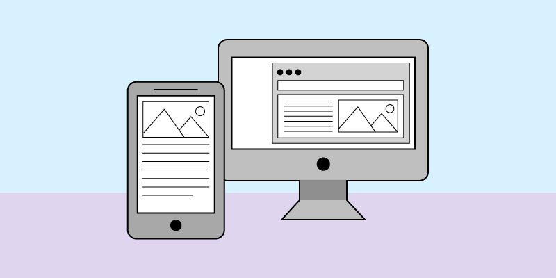
    Most of us can hardly conceive what life would be like without the internet. The ability to have the world at your fingertips or the click of a mouse. But what if you can’t use a mouse? What if you can’t see the screen of your computer or hear a video playing?

    As soon as we ask these types of questions, we can begin to see how the internet can create barriers, leaving some users frustrated and reliant on others. However, once we can recognize these barriers, we can begin to remove them, creating web content, design, and tools that everyone can use regardless of their ability. Here is an introduction to the basics of web accessibility. 

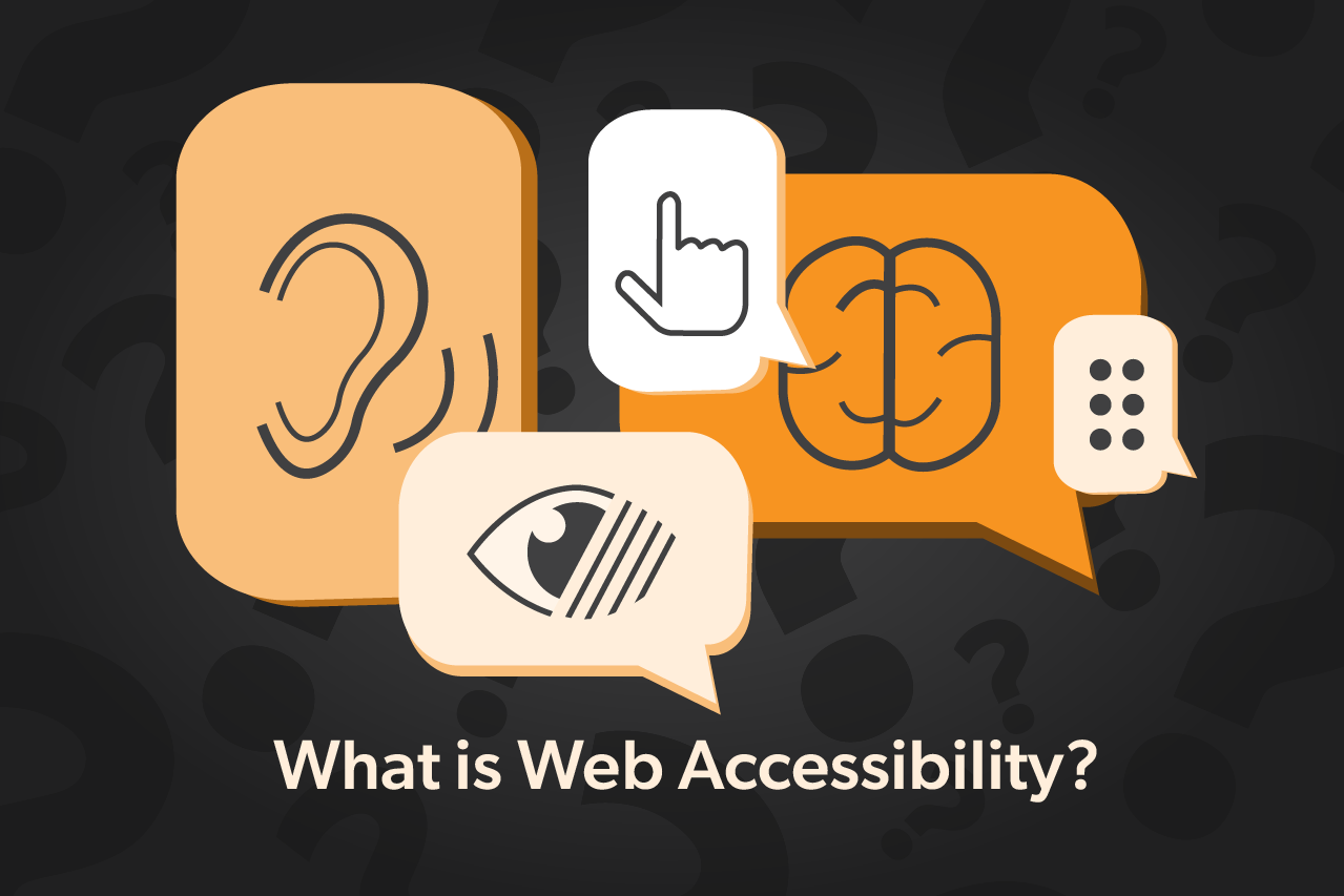
    What is Web Accessibility?

    We have all experienced the annoyance of squinting at a poorly selected font, blurry images, or trying to navigate a page that is not compatible with mobile devices. While these issues are a slight inconvenience, they can restrict or eliminate their internet usage to some. 

     Web accessibility provides everyone with the same access to digital information without any hindrance, regardless of impairments or disabilities. Users should be equipped with the tools and capabilities to aid in the website’s perception, understanding, contribution, navigation, and interaction. 

    Why is Web Accessibility Important?

    The internet is an essential resource in almost every aspect of life. During the 2020 COVID pandemic, the internet became a lifeline to many, keeping the world connected. The high rate of digital adoption within the past two years has revolutionized our lives and society. Still, a significant percentage of the world’s population is limited or cannot use the internet due to accessibility barriers. 

    Web Accessibility for Users

    Accessibility barriers hinder users with disabilities from interacting and experiencing the internet. According to the World Health Organization (WHO), over 1 billion people have some disability, with the rates continuing to rise from chronic health conditions and population aging.  

    There are three disabilities or impairments: conditional or situational, temporary, and permanent. Conditional or situational impairment is the difficulty accessing digital information due to the situation. An example of situational impairment would include noise, poor lighting, distractions, or slow internet speed. Permanent and temporary disabilities are more commonly associated with disability, including visual, hearing, neurological, cognitive, and motor issues. 

    Web Accessibility Benefits for Your Business

    Web accessibility often is thought only to remove barriers for users facing disabilities. However, accessibility can be just as beneficial for your online business as it can its users. 

    Brand Reputation

    Having an accessible website creates an inclusive environment for your users while providing them with more meaningful interaction with your website and brand by building trust and reputation. For instance, Facebook has been praised for ensuring its site accommodates blind users.

    Expanding Market

    Your online business lives and breathes according to your customers. The internet is the best place to reach out to customers and expand your market. By making your website accessible, you will cater to an estimated $1.2 trillion market that the competition could be overlooking. As a result, you are increasing your customer retention and acquisition. 

    Legal Compliance

    Additional, by ensuring your website is accessible, you could mitigate a frivolous ADA lawsuit. One lawsuit is filed every hour either in federal court or in California under the Unruh Act directly violating ADA guidelines. 

    Web Accessibility can be beneficial for both your customers and your business. But what are the guidelines for Web Accessibility, and how are they determined?

    Website Accessibility Guidelines

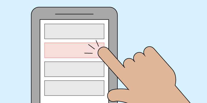
    Users with a disability can change how they interact with the internet using assistive software. However, how users interact is not always predictable. For instance, an individual with low vision could use a screen reader or screen magnifiers. Ideally, a website’s content should be accessible for all users, including users who require assistive software.  

    The Web Content Accessibility Guidelines (WCAG) are the most widely cited international standards for web accessibility. WCAG included specific checkpoints and recommendations based on a principle-based approach to ensure all users can share in the same experience. 

    The Four Principles of Website Accessibility

    WCAG’s principle-based approach is the foundation for producing content and for anyone who wants to use the web. POUR is an acronym that describes accessibility as perceivable, operable, understandable, and robust.

    Perceivable

    The state or quality of information and elements on a website has to be capable of being perceived through the senses, leaving nothing left undetectable or invisible. Most users perceive information relying on visuals or sight. Visually impaired users perceive information through sound or touch. For instance, if a user cannot see an image, how can they perceive the content of the article they are reading? Images with well-written alternative text can provide context, allowing them to still perceive the content just as individuals with sight. 

    Operable

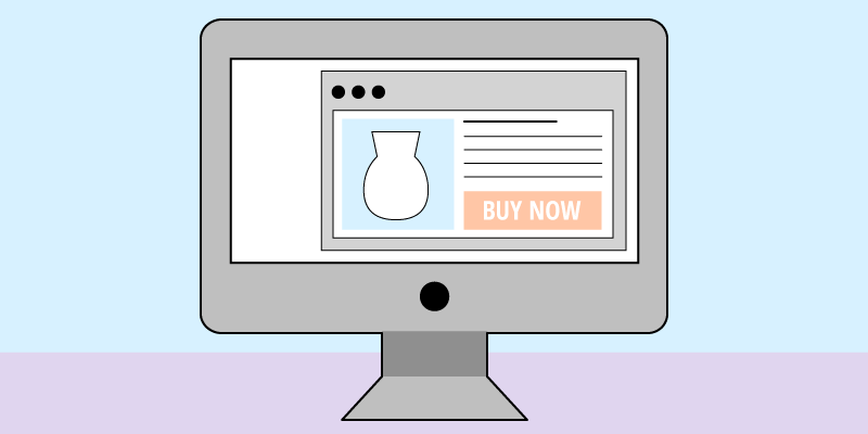
    Users must be able to operate a website’s interactive elements. Interactive interface elements such as buttons, navigations, or controls should operate for all users. Users must operate the interface elements by first identifying them and engaging with them. For instance, have you ever tried to click a submit button on a website, and nothing happened? Your interaction with the malfunctioning button has limited your experience or has prevented you from using the website how you intended. 

    Users who cannot interact with elements physically by clicking, or tapping, rely on the tab key, voice commands, or other assistive devices to engage with elements. Websites should not require actions that some users cannot perform. Some users will even not use your website if they cannot function with a keyboard alone. These barriers can limit your website’s reach and create a poor users experience for all users. 

    Understandable

    Websites should be clear and concise in presentation and format, with predictable patterns of use and design. Users should have no issue comprehending the meaning and purpose of the presented information. The “understandable” principle also applies to user interaction elements such as buttons, semantic markups within the code, and other elements to your site. Everything should have a purpose and a meaning behind your site’s content.

    Robust

    Robustness is the ability for content to function reliably using various technologies, including assistive devices. Websites need to provide the same information and interactivity, regardless of access through screen readers, touch screens, or web browsers.

    The lack of these four principles will make your website inaccessible to your users. Therefore, the WCAG recommendations branch out into more detailed levels of accessibility based on these four leading principles. There are three compliance levels: A, AA, and AAA. Each level increases the requirements for web accessibility compliance, grading the website based on the requirements met. 

    Closing

    The internet has become a modern necessity to everyone, offering independence and freedom unavailable through any other medium. We need to start asking how users interact with our websites and break the barriers to create a more inclusive online environment through web accessibility. Web accessibility allows everyone to access the same digital information without hindrance, regardless of impairments or disability. Providing the tools and capability to your user’s aid in your site’s perception, understanding, contribution, navigation, and interaction.  

    As you become aware of the importance of web accessibility and its impact on both your company and your customers, it is essential to know you are not alone. Integrating accessibility can seem intimidating at first, but 216digital  is here to help. We have a passion for web accessibility and ensuring your business is thriving in a continuously growing medium. If you would like more information on web accessibility or how to make your website accessible today, schedule a 15-minute complimentary consultation with our experts or request a free ADA compliance scan today by clicking the link below.

    Request A Free ADA Compliance Scan

    Greg McNeil

    January 13, 2022
    216digital, ADA Compliance, Website Accessibility
    Accessibility, ADA Compliance, ADA Website Compliance, Web Accessibility, Website Accessibility
  • Making the Internet Accessible – The History of Website ADA Compliance

    Making the Internet Accessible – The History of Website ADA Compliance

    ADA website compliance!

    It’s become a popular topic as of late, especially for business owners that have a website. 

    But, it might surprise you to learn that ADA compliance has been around for quite some time. Its current popularity is a direct result of its evolving legal interpretations for what makes a website accessible.

    Below, we’ve plotted the history of Website ADA Compliance and its role in preventing discrimination online.

    (more…)

    Greg McNeil

    July 23, 2020
    216digital, ADA Compliance, Website Accessibility
    ADA Compliance, ADA Lawsuit, ADA non-compliance, ADA Website Compliance
  • Are ADA Overlays a Liability? Here’s What Accessibility Experts Had to Say

    Are ADA Overlays a Liability? Here’s What Accessibility Experts Had to Say

    Lawsuits for websites that are not ADA complaint continue to threaten many internet businesses.

    These companies often turn to accessibility tools to quickly make their sites ADA compliant, thinking they’ll be protected from a lawsuit.

    Accessibility tools (screen overlays and widgets,) such as UserWay, AccessiBe, and AudioEye, work by adapting website content to users’ needs.

    Yet, the levels of accessibility that these tools offer varies from overlay to overlay. To cut through the noise surrounding website accessibility tools, we reached out to several industry experts.

    The ADA Experts

    Kim Testa: The Executive Vice President of the Bureau of Internet Accessibility, industry leaders in eliminating the accessibility digital divide since 2001.

    Eli Freedman: The Senior Partnership Success Manager of accessiBe, a two-part web interface and ai accessibility tool hailed as “World-Leading Web Accessibility Technology.”


    Richard Hunt: Partner, Hunt Huey PLLC. Hunt Huey PLLC has a national disability rights practice that includes defending real estate developers, retailers, restaurants, shopping centers, banks, apartment owners and managers, hotels, single-family developers, homeowners associations and other enterprises in ADA and FHA litigation.

    With their professional insight, we find answers to some of the most pressing questions surrounding the use of website overlays to achieve ADA compliance online.

    1. Are screen overlay products effective for making websites appear to be ADA compliant?
    2. If you install a screen overlay product, will you be less likely or more likely to become the victim of an ADA non-compliance lawsuit?
    3. When using a screen overlay product, can site visitors use their own assistive technology?

    Are screen overlay products effective for making websites appear to be ADA compliant?

    Screen overlay products improve website accessibility by adapting the existing assets of a website to best fit the needs of a disabled user.

    These changes are not automatic and must be triggered by the user before making any visible adjustments to a site. We asked Kim, Eli, and Richard their perceptions of the effectiveness of these accessibility tools.

    Kim Testa|The Bureau of Internet Accessibility

    “In the world of digital inclusiveness and accessibility, overlay products do nothing to ensure the original website code is compliant to WCAG 2.1 A/AA.  

    They work by “recreating” the web pages with “their” code. A script is then inserted into the website’s original code, which in turn hijacks the user’s screen reader and forces them to learn a new technology. In some instances the overlay solutions make the user identify themselves as someone living with a disability. 

    Keep in mind that 99% of people that need assistive technology, have their own and do not need, nor want to be forced to use someone else’s. While overlays may sound like an easy, quick-fix – they do absolutely nothing to remediate the accessibility issues of a website, web-based applications, or native mobile apps.”

    Eli Freedman | accessiBe

    “There has been a lot of buzz in the marketplace discussing why web accessibility overlays are not compliant. We can say for certain that overlay companies pose their solutions as being compliant, when in fact they are not.

    Research shows overlays only handle up to 25% of the WCAG requirements leaving the remaining 75% inaccessible and vulnerable to lawsuits. Why? Those overlays only handle the more simple requirements which are the CSS adjustments of a website. For instance, color contrast ratios, stop animations, larger cursors, font colors and sizing, and more.

    Where accessiBe differs from other layover tools is that it handles both the foreground CSS adjustments and the 75% ‘heavy background lifting’ WCAG 2.1 AA requirements like Aria attributes, assistive technology compatibility, alt tags for images, contextual understanding Ai that assigns all the correct elemental structures like pop-ups, forms, icons, buttons, and website behaviors.”

    Richard Hunt | Hunt Huey PLLC

    ““ADA compliant” isn’t really a meaningful question because there is no objective regulatory or judicial standard for business website ADA compliance (Government websites covered by the Rehabilitation Act have a standard almost identical to WCAG 2.0 AA). In fact, there isn’t even agreement on why a website has to be accessible under the ADA, and until you know why the website needs to be accessible it is impossible to say whether it meets that need.

    We can say that in the broadest terms a website does what the ADA requires if a disabled individual has meaningful access to all the goods and services it offers. That is a subjective standard because it depends on the particular user and their assistive technology. Government agencies, businesses, and lawyers hate subjective standards, so most are using WCAG 2.1 or 2.0 AA as a kind of substitute measure of accessibility. Those standards involve compromises (that’s why there is an AAA standard) which means that even a website that conforms to WCAG 2.1 AA may not be accessible to all users and all assistive technologies.

    The courts have not yet resolved whether the compromise represented by WCAG 2.1 AA is good enough to satisfy the ADA or is perhaps even better than the ADA requires. As for overlays, if you don’t know what the standard is you can hardly claim to meet that standard. A claim that an overlay makes a website ADA compliant will always be false, no matter how good the overlay is.”

    Bonus Tip: To find out if your website is accessible, you can request our accessibility specialists to conduct a free site scan, by clicking here.

    If you install a screen overlay product, will you be less likely or more likely to become the victim of an ADA non-compliance lawsuit?

    For many companies, the purpose of installing an accessibility tool is to protect themselves from an ADA non-compliance lawsuit.

    But how effective are accessibility screen overlays at protecting your business? Here’s what Kim, Eli, and Richard had to say.

    Kim Testa|The Bureau of Internet Accessibility

    “Since overlays really don’t fix the issues, websites are wide open for a lawsuit. There are tools on the market that are used to identify websites that are using overlays and widgets…  

    It’s simple for lawyers to get a list and target the companies using them. There is no magical solution to becoming digitally compliant, the only way to know if a website is compliant is to have a complete audit, both automated testing and manual testing (done by individuals living with disabilities) all done at the same time.”

    Eli Freedman | accessiBe

    “If a website owner has a layover tool that does not handle the ‘heavy background lifting’ as stated above, they are definitely at a greater risk of being served a demand letter or a lawsuit.


    Reports have been received from people in the disabled community in tandem with law firms around the US are grouping together to find websites that are using layovers and targeting them with ADA lawsuits and demand letters as they too know those layovers are not making their websites accessible.”

    Richard Hunt | Hunt Huey PLLC

    “Plaintiff law firms use software scanning tools to look for non-conformance with WCAG 2.1 or 2.0 at success level AA. A product can only reduce the likelihood of a lawsuit if it makes the website look like it is in conformance when scanned by the most commonly used software tools. 

    As I understand it software scanning tools will not ordinarily trigger the accessibility features of an overlay that requires a user choice. Thus, if the website relies on the overlay to correct underlying non-conformities based on a user choice the overlay will not reduce the risk of a lawsuit. 

    It is also important to remember that software scanning tools not only miss errors, they also report false positives. For example, because a scanning tool can’t tell if an image is purely decorative it will mark a decorative image without alt text as a nonconformity even though such images are not required to have alt text under WCAG 2.1 AA. 

    To reduce the risk of litigation any solution must make the website appear perfect or almost so to the most commonly used scanning tools, whether or not that really makes the website easier to use for those with disabilities. As for plaintiffs targeting websites that use layovers, it would not be surprising if it were perceived by the plaintiff’s bar as a profitable enterprise.”

    When using a screen overlay product, can site visitors use their own assistive technology?

    Many disabled internet users have been dealing with accessible websites for a long time. Since most sites aren’t aware of their needs, they’ve had to rely on their own assistive technology to navigate the internet.

    But if a disabled user tries to use their own tools on a site with an accessibility overlay, can both systems communicate with each other?

    Kim Testa| The Bureau of Internet Accessibility

    “Yes, but as [I] stated earlier, a user may come to the website with their own assistive technology but, upon entering the site, the script will take over and force the visitor to use the overlay technology, making the user abandon their own, known assistive technology.  

    Many times when this happens the user will leave the site and never return. Companies are looking to acquire new visitors not frustrate them to the point that they leave. ”

    Eli Freedman | accessiBe

    “In most cases, yes they can, however, that does not mean that it will be completely compatible with all assistive technologies like screen readers or keyboard navigation only.

    In addition, there are certain layover tools that have screen readers embedded within their ‘solutions’ which is purely a marketing gimmick. This is actually counterproductive since those with disabilities have their own assistive technologies and the embedded screen reader’s conflict with their own technologies.”

    Richard Hunt | Hunt Huey PLLC

    “Whether a particular overlay is compatible with any particular assistive technology is not within my technical expertise. What I can say is that in general, the ADA requires that any facility be accessible to disabled individuals as they come to it; that is, with whatever technology they are accustomed to using. You can’t tell a wheelchair user, for example, that they need to switch to a mobility scooter to enter your store. 

    A similar principle exists in the Web Content Accessibility Guidelines; that is, they are intended to create accessibility solutions that do not depend on the user’s choice of assistive technology to the extent that is possible. An overlay that is incompatible with the most commonly used assistive technologies, and in particular with the most popular screen readers, won’t be regarded as improving the accessibility of a website for purposes of the ADA. 

    There may be some assistive technologies so old or so rare that they do not have to be accommodated, but to satisfy the ADA an overlay must work seamlessly with the most commonly used assistive technologies.”

    Now it’s Your Turn

    At this point, you might be thinking, “Do I need an accessibility screen overlay for my website?” 

    As you just learned from experts, while you can use a screen overlay to make your website appear more accessible, it’s only helpful to a certain extent.

    Keep in mind that whether or not you use an accessibility overlay, there is still some manual remediation you’ll need to do within your website’s code.

    Before installing or remediating anything on your own, you should know if your website is ADA compliant. Request a free ADA compliance scan today by clicking the link below.

    Request A Free ADA Compliance Scan

    After our ADA specialists scan your site you’ll have the expert information needed to proceed with improving your website’s accessibility.

    As the environment around website accessibility continues to evolve, we want your business protected from an ADA lawsuit.

    Greg McNeil

    May 20, 2020
    216digital, ADA Compliance, Web Design, Website Accessibility
    ADA Compliance, ADA Lawsuit, ADA non-compliance, Website Accessibility, Website Accessibility Tools
  • The Small Business Marketing Guide to Surviving COVID-19

    The Small Business Marketing Guide to Surviving COVID-19

    The coronavirus (COVID-19) has been a drastic agent of change across the globe. It’s forced us to adapt how we live and work to the new pandemic environment.

    If things go right and we flatten the coronavirus curve, we could be social distancing for quite a while. Already, this has put many small businesses in a difficult position, especially those that rely on in-store purchases.

    It’s important to work together during this time. So, to help other small businesses, we’re sharing this guide to digital marketing during COVID-19. By improving your business’ presence on the internet, not only can you endure the pandemic, but build the foundation for success when it ends.

    (more…)

    Greg McNeil

    April 17, 2020
    216digital, Applied Ecommerce, Digital Marketing, SEO, Uncategorized, Web Design
    Coronavirus, COVID-19, Digital Marketing, ecommerce website, SEO
  • Marketing Meets the Age of eCommerce

    Marketing Meets the Age of eCommerce

    In 2017, Cyber Monday shoppers raked in a record-breaking $6.59 billion dollars. It was recorded as the largest online shopping day ever with sales increasing 16.8% over the year prior. It even topped Black Friday online sales by $1.5 billion, if you can believe it. With numbers climbing each year, it will be interesting to see what sales 2018 bring.

    Cyber Monday is the online equivalent to Black Friday shopping, without all of the chaos and waiting in line! It was birthed out of the ever-growing digital age, where millions of consumers have chosen to skip the 3 AM alarm and avoid the unruly mobs at major retail stores. Now with your computer, mobile phone or tablet, you can check out your favorite retail spots at your own convenience. The savings are usually just as good and you don’t even have to leave the comfort of your own home. This means no more cutting into your holiday and interrupting time with your friends and family. website marketing

    Capitalize on Cyber Monday

    If you are looking to take advantage of this growing trend, it is important to keep these tips in mind. Many people believe that most Cyber Monday shoppers already know what they want and are just waiting for sales to begin. This is not always the case. While it is common that most Black Friday and Cyber Monday shoppers form a game plan for where they are shopping, most consumers are visually driven. Don’t underestimate the ability to turn heads and draw attention, even on your website. Suggestive marketing and product placement work just as well in person as they do online, so keep cross-selling and suggestive selling products that are associated with one another. Dedicate an entire section to related products.

    Start your content campaign by optimizing your products. SEO is a crucial tool to have all year, not just during this weekend. Doing your keyword research is a habit that never goes out of style, especially right before sales are expected to spike. Content and descriptions rich with SEO keywords will help your products be easily discoverable by the search engines. Be sure to include Black Friday/ Cyber Monday related keywords in your content and use wording that creates a sense of urgency to your consumers, such as “for a limited time only” or “while supplies last.”

    Man Holding A Credit Card Over A Laptop.

    Also, plan a schedule for your sales to ensure the correct discounts are applied at the appropriate times. Remember it is important to be competitive to stand out among the competition. Consumers are looking for a minimum of 20% off the original price, but Thanksgiving weekend is the time to go big or go home. You need to get yourself noticed among the thousands of competitors out there.

    Social media is also a great way to capitalize on traffic. Not only is it a great way to gain exposure, but social media allows users to engage with your product. Your brand will get more visibility and others can engage with items, even users who aren’t shopping. This is extremely important as these are the users that come back in the future. Much of social media engagement depends on getting your name out there and developing a following.

    The Amazon Myth

    One thing to keep in mind is sales don’t always begin in the Amazon funnel. It is important to keep your Amazon storefront optimized accordingly, but don’t neglect regular search or PPC campaigns. Contrary to popular belief, most searches don’t begin with Amazon. A research study showed that 70% of searches begin as a query or a phrase in a search engine. If you are one of the consumers who aren’t sure what they want specifically or where to even find it, you would probably want to avoid Amazon initially. You would need to do your research first. Keywords that use phrases like “near me” are a great way to capitalize on that search. It makes more sense to ask a search engine than it does to start browsing blindly through products.

    Often times the funnel does direct you towards Amazon if your products are optimized correctly. In optimizing your products for SEO, you actually have the opportunity to capture both types of search queries by using similar keywords. Don’t neglect your organic optimization by just focusing on Amazon when you are trying to gain visibility. It is better to be safe and plan for both than to miss a channel entirely. ecommerce platforms

    Convenience Means Conversions

    The beauty of online shopping is the ease of the transaction. Keep all the technical aspects of your page optimized to encourage a positive user experience. Site speed is crucial, especially during the chaos of Black Friday and Cyber Monday. If your site speed is slow or appears to have a lag time, your customers may take their business to one of your many competitors. Timing is everything, especially this weekend. If you can ensure a smooth transaction during heavy traffic, it is much more likely that users will remember this experience. Always leave an impression to keep them coming back, even once the holidays pass.

    Greg McNeil

    November 28, 2018
    216digital, Digital Marketing, Web Design
    Black Friday, Cyber Monday, Digital Marketing, ecommerce design, SEO
  • 5 SEO Metrics That Won’t Fail: The Recipe for A Good, Old-Fashioned Organic Listing

    5 SEO Metrics That Won’t Fail: The Recipe for A Good, Old-Fashioned Organic Listing

    Between algorithms and techniques, SEO is constantly evolving in order to deliver the best results to users everywhere. With each and every update, best practices are changing and it is vital to stay on top of the game. The best way to remain relevant and become a front-runner with your content is to dedicate plenty of research and care when crafting each post. A well-informed page is a ranking page.

    Do Your Research: Keywords Are Crucial

    Before you set out to publish engaging and alluring content, it is important to develop a good baseline with in-depth keyword research. Not only does this research help to develop your topics, it allows you to get a sense for what readers are looking for. SEO keywords are your trail of breadcrumbs that help shape your article and give you a vision for the direction your content will go.

    Keywords are also an insight into what is going on in the industry. Much like a fad, they are constantly changing depending on the times and trends. Digital marketing is a field where practices and methods can change by the hour, which is why it is so necessary to develop a good baseline of data and strategy. Best practices this month aren’t always in style by next month.

    Target Users with SEO Content: Don’t Write for Robots 

    Digital Marketing

    The best SEO content is natural, keyword-focused content. Google does not want to see content tailored towards the robots. Just write with a natural, conversational tone. People can sense when you talk above them or when writing becomes superfluous. Often times, adding multiple sentences to get a specific keyword ranking, or even dropping words can disrupt the content flow. Don’t ever compromise your quality. A quality SEO writer is first and foremost a writer.

    It is vital to remember that content exists to help users and create the best user experience. SEO should reflect this in the tone, as well as the formula. Awkward verbiage or stuffed keywords can signal to Google that the page in question may not have the best SEO-driven content. Also, the language can take your reader out of their element or cause them to seek more engaging information. Similar to cooking, with SEO presentation is everything.

    Keep it Fresh: Manage Content Regularly to Remain Relevant

    An active domain is a happy domain. If Google scans your indexed pages and the number is regularly growing, it’s going to give your site some recognition. Although there is no penalty or suggested schedule for posting content, it is important to stay relevant. Activity shows the robots that the domain is updated regularly and is well-managed.

    Similar to keyword research, keeping up with current trends and topics will also attract users looking for a fresh perspective and applicable tips. Writing about what’s in the news is also a great tactic to stay ahead of your competitors. Content writers that know the market are not only great resources to validate skills, but they are going to attract a larger audience. Websites with a generous following typically have a strong authority and will appear attractive to Google.

    Don’t Ignore the Background: Technical Optimization is Crucial

    If you haven’t already made the switch to HTTPS, stop whatever you’re doing right now and do it. It is one of the best things you can do for the health and integrity of your website. HTTPS is the most common and most secure protocol available. Not only is it a best practice, but HTTPS protects users from malicious parties that take advantage of your site. If Google detects a secure protocol, you’ve gained a major SEO advantage.  Web Development

    Also, be sure your site is mobile-friendly. Optimizing your site for AMP, or Accelerated Mobile Pages is not only something encouraged by Google, it is necessary to rank at all in the search results. Not having a mobile-friendly site can be a major penalty and hurt the integrity of your site.

    Avoid 404 errors at all costs. Nothing will drop your ranking in the search results faster than having a bunch of 404 errors on your site. Fix these broken pages as fast as possible to ensure your links are in working order and boost the overall user experience.

    Invest in Your Own Crawl: Audit Your Pages on a Regular Basis

    Don’t wait for the search engine robots to crawl your pages. Technology is crucial to ensure your site is behaving as it should. Investing in crawling software to help you manage, strategize and audit your site on a regular basis. SEO strategy is ever-changing and a crawling software will be your best friend to help identify your trouble areas and stay on top of the SEO content. Also, it will help ensure every page is being properly indexed and visible.

    If you need help with these tips or some are out of your control, contact 216digital to get the help you need! We are a local agency and Miva developer in Cleveland, OH. For Cleveland web development or assistance with SEO services, 216digital is the extra set of eyes your site needs. We specialize in social media, Cleveland web design and are experts with Miva design.

    Though trends are ever-changing and updates come more often than not, one fact remains the same. Google is always seeking to capitalize on user experience. Whether you have a personal blog, a directory or an eCommerce page, keep in mind that your content has a larger audience than you may realize. After all, the robots aren’t the only ones who are watching.

    Greg McNeil

    July 3, 2018
    216digital, Content Marketing, Digital Marketing, SEO, Web Design
    Digital Marketing, Miva Design, responsive web design, SEO
  • SEO in 2018: Times They are a Changin’

    SEO in 2018: Times They are a Changin’

    A new year is upon us and with it a plethora of updates and algorithm changes to make you second guess your ranking methods. From Google’s surprise, mid-december Maccabee update to the FCC’s net neutrality repeal, 2017 was full of web-related shifts. So to help, we’ve compiled a list of some the best SEO & digital marketing articles covering the 2018 trends to look out for.

    • Voice Search
    • Featured Snippets
    • Mobile-First Indexing
    • Meta-Description Length
    • Video Content

    The rise of Voice Search

    google home
    Image courtesy of NDB Photos. Licensed under Creative Commons 2.0.

    With the increase in smart speaker sales like Alexa and Google Home, there may soon be a shift in the way people search online. Though the impact of new voice search related keywords is unsure, it seems likely this’ll be a factor in the coming years.

    • SEO in 2018: Optimizing for voice search and SEO without SERPs is here with Google Assistant, Home and Amazon Echo. Here’s how to survive. by Bryson Meunier
    • OK, Google: How Do I Optimize My Site for Voice Search? By Dan Shewan
    • How to Optimize for Voice Search by Sherry Bonelli

    The push for Featured Snippets

    rich snippet bread

    Google’s continued focus on user friendly experiences means featured/rich snippets or knowledge boxes are becoming the norm. In fact, back in 2015 Ben Goodsell reported that the CTR on a featured page increased from 2% to 8% after it was placed in an featured snippet. And the number of these featured snippets in search engines has only grown – meaning that optimizing for them now could mean a huge boost in organic traffic.

    • Google’s latest search updates brings more content to Featured Snippets & Knowledge Panel info by Amy Gesenhues
    • Featured snippets: Optimization tips & how to ID candidate snippets by Brian Ussery
    • How to optimize featured snippets for voice search by Jessie Moore

    The start of Mobile-first indexing

    online shopping

    Following the trend of users searching mostly on mobile, Google announced in November that it planned to move towards indexing the mobile versions of sites first. This means that Google will consider the mobile version of your site before the desktop version when ranking. So more than just having a responsive site, it’s key to have a truly mobile friendly version.

    • Google’s Mobile First Indexing: Tracking When Google Moves Your Site and Preparing for the Switch by Vanessa Fox
    • Google Begins Mobile-First Indexing by Moving M-Dot Site to Responsive by Andreea Sauciuc
    • Mobile-First Indexing: Everything we know, and how it could affect you by Sam Underwood

    The increase in meta-description length

    meta description

    For anyone doing SEO, the 155 character limit is all too familiar. However, the frustration of crafting a tempting summary with a targeted keyword in the limited character length is about to be a thing of the past. Google recently boosted their snippet limit to 300 characters!

    • How Long Should Your Meta Description Be? (2018 Edition) by Dr. Peter J. Meyers
    • Google officially increases length of snippets in search results by Barry Schwartz
    • (Update) 5 Tips for Google’s New Meta Title Guidelines in 2018 by Adam Fifield

    The growth of video content

    youtube graphic

    Youtube is the second largest search engine after Google, and the growth in video search is only projected to continue. After all, watching a video is more engaging than reading text. And the use of visuals, voice, and written text to explain ideas is a lot easier for people to understand.

    • The 3-Part Secret to Video Marketing in 2018 by Anthony Helmstetter
    • YouTube SEO: The Ultimate Guide by Brian Dean
    • 4 Exciting Video Marketing Trends for 2018 by Michael Brenner
     

    And for all you All-In-One Guide fans –

    • How are you changing your content marketing program in 2018? By Rachel Lindteigen
    • How to Rank in 2018: The SEO Checklist – Whiteboard Friday by Rand Fishkin
    • Digital advertising in 2018: 5 trends to watch by Ginny Marvin
    • 29 Experts on the Most Important 2018 Social Media Trends by Danny Goodwin


    Anything we’re missing? Let us know!

    Greg McNeil

    January 2, 2018
    Content Marketing, Digital Marketing, Responsive, Responsive, SEO, Web Design
  • Black Friday Shopping: Is Your Online Business Ready?

    Black Friday Shopping: Is Your Online Business Ready?
    America’s favorite shopping season is right around the corner and with it a barrage of online bargain shoppers. Is your site ready to handle the Black Friday shopping rush? If the answer is anything but yes, you may want to consider a quick preparatory revamp. Why? Because the year-end holiday season is not only the best time to meet your annual sales goals, but a great time to capture new customers. Following Thanksgiving, Black Friday and the last two months of the year are prime for gift-giving; people are shopping for themselves, their family, and their friends. Not to mention, over the last eight years, Black Friday retail e-commerce spending alone went from $534 million USD to $1970 million USD  – and it’s only expected to rise again this year. Which means optimizing your site for online sales now can ensure your business is ready to roll this holiday season. So how can you prepare? The first step is to decide which holidays you want to run promotions on. Once you’ve determined that and set up a promotional calendar, you can move on to polishing your website and online holiday marketing strategy. To make it easier, we’ve compiled a checklist to help get you on your way.

    Getting Your Website in Gear

    Image of a person browsing an ecommerce platform
    1. Check Your Server Traffic Capacity. Black Friday weekend is sure to draw a lot of traffic to your site, especially if you are running promotional deals. So making sure your server can handle the influx of customers is likely to make both their and your experience easier.  Check your server capacity before the season starts at  LoadImpact.com or Blitz.io.
    2. Create Landing Pages for Your Black Friday Deals. If you plan on setting your customers up with some awesome deals, it’s important to make sure they know what they are and where to find them. Landing pages on your website specifically made for the Black Friday/Cyber Monday promotions can help alert your customers to all the seasonal discounts you have on offer. Going the extra mile and creating a banner for your deals to be displayed on every page, will also help ensure no one misses out!
    3. Make sure your website is mobile friendly. The share of mobile sales on Black Friday in 2013 went from 27%  to 48% in 2016. And with more and more customers turning to their phones for online shopping, having a site with responsive design is more important than ever. Don’t know whether your site is mobile ready? Check it out with Google’s Mobile-Friendly Test. And if you still can’t figure it out, let us take a look!
    4. Test and troubleshoot everything. Even with the best promotions, the holiday shopping season could still be a complete bust if your customers aren’t able to make purchases from your site.  Whether it’s a broken link or simply a slow loading page, it’s important to make sure you’ve tested the durability of your landing pages and made sure your promotional coupons are working fine.
    5. Make the checkout process as seamless as possible. Simplicity is key. Customers like it when they can make a purchase with the fewest clicks possible – and obvious clicks at that. So spend some time ensuring your website has a user friendly interface with clear add/delete item and checkout buttons. And if you need a little help, let us know.
    6. Have your Shipping and Returns Policy for the shopping season in fine print. To prevent any future misunderstandings or complaints, it’s best to have your holiday season shipping and returns policy listed on your website where customers can easily access or see it.
    7. Track EVERYTHING. To make sure you’re getting the results you want and your leads are converting into sales, keep a detailed track record of every change you’ve made to your site and how it has affected your conversions.  A great way to do this is through tracking your Google Analytics and Facebook Pixel data.

    Marketing Yourself Right

    Images of a persons Startup company Now that you have your website ready to go the next thing to tackle is your marketing strategy. To start, look at your past marketing data to see how your business performed during previous years. This will make it easier to plan a marketing strategy as you’ll have a better idea of what worked and what didn’t. Once you have that data, you can start to plan for the future holiday season. And the following tips will help you put your best foot forward!
    1. Research your customers. A good marketing strategy starts with great research. For example, do you know 100% who your customers are? Have you created buyer personas? If you haven’t, check your Google Analytics demographics to ensure that the personas you have in mind match the factual customer data retrieved by Google. This will help you market to not only your current customers, but all potential buyers as well. Still unsure? Take a look at this helpful B2B Buyer Persona Guide for a more in-depth look on how to make your customer-data work for you.
    2. Create a winning PPC Campaign. Pay-per-click is one of the best ways to reach targeted customers. If you have optimized your campaign with the right keywords, your ad should appear at the top of Google’s search results. However, if you did not have the time to get your SEO and keyword targeting in place, PPC can help! For example:
      1. Shopping Ads is one of the best ways to get your products in front of your customers, because its CPC is much lower when compared to a Text Ad, and it can get you better conversion rates. You can also target local customers with Google’s Zip Code Targeting.
      2. And if you are already running PPC campaigns, the holiday season is a good time to start a remarketing campaign. Reach your customers who are actively searching for your products, or are loyal to your business with remarketing campaigns.
    3. Utilize social media for customer insights. Your social media channels can be a treasure trove of information. Places like Facebook, Twitter, and Instagram are full of consumer opinions on products and services. And not just on products they currently use, but items they are interested in buying. Put this information to use by –
      1. Promoting your Black Friday deals on social media sites like Twitter or Facebook.
      2. Creating product hype and awareness by offering special discounts to  your followers.
      3. Closely monitoring comments or mentions on your social channels and responding to any customer queries and feedback promptly. You can even make use of social listening tools to listen to what people are saying online about your brand or products.
      4. Creating your own hashtags for the holiday season. You can stick to the regular hashtags of #BlackFriday and #CyberMonday, of course, but you can also create hashtags specific to your business. If you do, make sure you plug them on all your marketing channels- website, social media, and emails.
      5. Using Facebook Dynamic Shopping ads, which are a great way target customers who visited your website and added a product to their cart but never followed through with the purchase.
    4. Start an email campaign targeting current customers. When it comes to getting results, email marketing is still very effective. Triggered emails like those to customers that abandoned full online shopping carts, still tend to bring in more customers than many social media campaigns.  To get the most out of your email campaign –
      1. Categorize your email lists.  Segmenting your emails into specific customer lists based on products they’ve looked at or purchased is likely to get you more email open rates.
      2. Personalize! Include the name of the subscriber and offer specific promotions based on their location.
      3. Create and manage your email workflows in advance. This will ensure that every email is catered to the customer receiving it, and be less work for you in the long run.
      4. Leverage your current customer base through exclusive deals. Not only will this help build anticipation for future Black Friday deals, but it will show your loyal customers that there is  some advantage in following you.
      5. Create a countdown timer for your emails to promote urgency.

    In the End

    No one knows your customers as well as you do and any website adjustment or marketing campaign should be planned with them in mind. However, we hope these tips will help get you and your site on your way to holiday-ready! And if you still have questions, let us know!

    Sources

    Desktop retail spending on Thanksgiving Day, Black Friday and Cyber Monday in the United States from 2008 to 2016 Share of mobile online sales on Black Friday from 2013 to 2016 How to Create Detailed Buyer Personas for Your Business Get Local with ZIP Code targeting Effects of List Segmentation on Email Marketing Stats Why You Should Spend More on Google Shopping vs Text Ads

    Greg McNeil

    October 18, 2017
    216digital, Digital Marketing, Ecommerce Platforms, Google AdWords, Google Analytics, PPC, Responsive, SEO, Social Media Marketing, Web Design
    Digital Marketing, ecommerce design, ecommerce website, PPC, responsive design, responsive web design, SEO
  • 8 Features of Excellent Websites in 2017

    8 Features of Excellent Websites in 2017

    By now many of us have earned our stripes in web surfing. We’ve experienced a countless number of websites, and are savvy enough to know which sites are well crafted and which could use a serious face-lift – usually within the first five seconds of a visit. But what is it that makes a website “great?” Below are eight features many high-performing websites currently employ that put them at the top of their rank.

    1. High Quality, Authentic Images

    Humans are visual creatures. Think back to the last time you sat through a presentation where the speaker went on for seemingly forever without any graphics or visuals to break through the monotony. You may have absorbed some of the information, but chances are you walked away without having gained anything more than a headache.

    This same principle applies to websites. Throw large columns of text at a user when they’re not expecting it (i.e. not a blog post) and they will leave your site without even a basic understanding of what you were trying to communicate. Studies show that users only read about 28% of the words on a page. Add that in with the fact that humans process images 60,000 times faster than words, and the best way to quickly express a message becomes obvious.

    Not just any image will do, however. The best performing images for a website follow a few guiding rules:

    • High Quality: With faster internet speeds comes more capability of loading high resolution images. Low quality, pixilated imagery will make your site appear dated and untrustworthy.
    • Authentic: Gone are the days when users would be appeased by staged stock images of smiling business people shaking hands. We know they’re fake, your users know they’re fake, and they no longer represent real businesses made of real people. It’s recommended to use images of your own team, office, and products to boost authenticity.
    • Closely Related: That beautiful image of a sprawling scenic overlook may be eye catching, but if it doesn’t do much to describe what you’re selling, it won’t be an effective use of browser real estate. Images on your website should be companions to your content and remind users why they’re there.

    2. Consistent Brand Voice

    Computer Screen With A Hello Speech Bubble.

    Though not limited to website design, a well thought-out brand voice is an important part of engaging users. All of your content on your website should follow the tone of your brand and reflect the core values of your business. Users will come to recognize your brand by various factors:

    • Tone: How do you want to communicate with your users? Consider your audience and the way that they use your site. For example, a financial institution may want to use a tone of voice that comes across as being professional and cordial, whereas a toy store can speak more whimsically.
    • Buzzwords: What kind of language will resonate best with your users? The types of words you might use for a gym will differ greatly from those used for a spa. Think of the types of keywords a user might search for, or what will draw them in.
    • Conciseness: How quickly should the user be taking in your content? If you want to draw your viewers in with a well-crafted aesthetic, you may need to pad your copy with the appropriate amount of wordage to paint the right picture. However, if you want your users to quickly flow through your site and into a purchase or action, you’ll want to keep your copy short and sweet.

    Once you have your brand voice, be sure to keep it consistent on every page of your site. This will keep your business recognizable and put users at ease.

    3. Fast Loading Times

    Loading Progress Bar.

    Have you ever clicked on a link to a website and hit the back button in frustration when it took too long to load? Users today have grown accustomed to fast load times and don’t want to wait. About 50% of all web users expect a web page to load in 2 seconds or less, and 40% will completely abandon the attempt after 3 seconds.

    This means that if your website is slow to load, you will only be gaining at maximum 60% of the traffic that you could get. There are many factors when considering the speed of your website:

    • Image sizes: Remember those high quality images we talked about? Unfortunately, images can have large file sizes that will bog down the performance of your site. Consider keeping the number of images on your site down to raise site speed, or use a program to optimize their size.
    • Hosting: Your site speed may be completely out of your hands if you’ve chosen an inexpensive hosting plan. Though cheap, oftentimes you are sharing a server with many other money-conscious business owners, which will slow down your site’s performance. If it’s your hosting that’s the issue, consider upping your plan.
    • Optimization: There are several ways to improve your site’s overall speed from the backend; too many to name here. If your site is slow, consider asking a web developer to optimize all of your settings.

    4. Simple Navigation

    Web Browser Showing A Generic Website Layout.

    Have you ever gone to a store for something basic like toothpaste and been completely overwhelmed by the number of choices you have to pick from? Suddenly, a simple errand has turned into a confusing situation. Users feel the same about website navigation; give them too many choices and they will give up and leave.

    This phenomenon, called the paradox of choice, deems that the more options presented to us, the more likely we are to become overwhelmed and not pick anything at all. In web design, 7 navigation links is generally considered the maximum number to hold, with 5 being the more optimal number. When choosing navigation links for your site, consider the purpose of your website and which ones would be absolutely necessary for a user to have a positive experience. If your site is very large and requires a multitude of navigation items, consider using a mega menu.

    5. Mobile First

    Mobile Phone Next To A Computer Monitor.

    Mobile-friendly websites are no longer a nice feature to have in 2017; they’re absolutely necessary. More people are browsing the web on mobile devices than desktops, pulling in at a ratio of about 56:44. This means that if you’re not catering to your mobile audience, you’re missing out on over half of your potential!

    Creating a great mobile experience is more than just having a responsive website, however. Mobile first design means exactly what it sounds like. Rather than designing based on a desktop monitor and shrinking it down for mobile, modern websites are now being designed first for mobile to create the best possible experience. Some factors that make mobile an entirely different medium from desktop:

    • Screen ratio: Many phones and tablets are designed to be held horizontally by default, meaning the screen size sits at a completely different ratio than most Desktop monitors. Side-by-side columns on desktop screens become far too narrow on mobile devices. Simply stacking the columns on top of each other for mobile is not the best solution either. After all, which column is more important/should be on top? Mobile first design addresses this issue before it even arises.
    • Screen size: Mobile devices have far less screen real estate than desktop monitors. Thus, making a desktop first design and paring it down for mobile often becomes a task of cutting out content that isn’t necessary. Mobile first design forces designers to first consider what is important for the user to have, preventing unnecessary content in your desktop view.
    • Touch interaction: Unlike most desktop monitors, mobile devices can be tapped and pinched, adding another dimension to the user’s experience. Rather than adding these features as an afterthought, mobile first design ensures that the entirety of the site is easily accessible to mobile users.

    6. Engaging Micro Interactions

    Website On A Tablet Showing A Section That Changes Color To Show It Was Clicked.

    Micro interactions are those little experiences we encounter on the web that serve a single purpose, such as a checkmark showing us that we filled in a form field correctly, or a confirmation that an order went through. These interactions are so common now that most of us barely take notice, but their effectiveness is anything but miniscule.

    Micro interactions serve to delight, engage, and deliver positive reinforcement to users to let them know that they’re performing the correct actions. Imagine hitting “send” in an email app and not receiving any indication that the button had been clicked or the email had been sent. How can you be sure that your email went out? Small indicators, such as the button changing color when clicked, the browser sending you out of your draft and into your inbox, or a notification alerting you that your mail has been sent tells the user that they have done everything correctly and that their job is done. Other examples of micro interactions include:

    • Play buttons turning into pause buttons when clicked
    • Form fields highlighting with a colored border when clicked
    • Load animations indicating that content is being loaded
    • Links changing color when hovered over to indicate that they can be clicked

    7. Frictionless (In the Right Places)

    Generic Website Showing A Product Page With A Buy Now Call To Action.

    Friction in web design refers to anything that stands between a user and their desired action. For example, a multi-page form before ordering a product, or a pop-up intrusion when reading an article. Generally speaking, friction on a website is frustrating for users and can drastically reduce conversion rates. Web users are in a hurry and want to consume content quickly – why stop them from doing what they came to your site to accomplish? Friction can be reduced in multiple ways, including:

    • Reducing the number of form inputs. Do you really need to ask for a user’s phone number, middle name, etc?
    • Clear call to actions. Users don’t want to have to search all over your website to find what they’re looking for. Identify what users most want to accomplish on your site and make it easy for them to access.
    • Make your header sticky. Users are now used to scrolling, however it can be frustrating to have to scroll all the way back to the top of a page just to access the navigation. Keep your header always in view for easy, seamless navigation.

    Though friction prevents users from doing what they want, it is not necessarily always a bad thing; in fact, there are times when you want to add friction to create a better experience, as it makes users stop and think. Experienced web designers know when to apply the brakes on a user’s journey, such as making a user confirm before deleting something. Accidental clicks are a real occurrence, so asking a user if they’re sure they want to delete something before it disappears for good can prevent frustrating experiences.

    8. Expert Usage of Color

    Color Wheel Showing Red, Orange, Yellow, Green, Blue And Purple.

    Have you ever wondered why so many fast-food restaurants use red and yellow for their logos, or why so many businesses paint everything with blue? Design isn’t just about making things look nice; a good designer understands the psychology of color and how best to employ them on a website. Each color can evoke an emotion from users. (Keep in mind that these meanings can vary from culture to culture.)

    • Red: The color of passion and aggression, red is full of energy and can evoke a sense of urgency.
    • Orange: This color is a mixture of red’s passion and yellow’s optimism, creating an upbeat hue that expresses playfulness. It is also the color of impulse, and thus is often used in “buy now” buttons.
    • Yellow: Bright and fun, yellow expresses happiness, sunlight, and a cheery tone.
    • Green: The color of both money and the earth, green is used to express wealth and environmental consciousness.
    • Blue: This color evokes trustworthiness and professionalism, making it an excellent choice for many businesses. However, blue can also express sadness and moodiness, so be careful.
    • Purple: Wisdom and royalty come to mind with purple, making it a good choice for businesses that want to express reverence or knowledge.
    • Black: Though not technically a color, black evokes luxury, making it excellent for expressing wealth.

    In Conclusion

    Though none of the features listed above are absolutely necessary to craft a high-performing website (I’m looking at you, Craigslist), they are important to keep in mind when considering the performance of your own site. If your numbers are down or you’re looking into a redesign, keep these tips in mind and you’ll be well on your way to an excellent website in 2017.

    Sources

    • Do Visuals Really Trump Text?
    • How Loading Time Affects Your Bottom Line
    • The paradox of choice and how it affects web design

    Greg McNeil

    September 18, 2017
    Responsive, Uncategorized, Web Design
  • Google AMP Pages for Ecommerce – INFOGRAPHIC

    Google AMP Pages for Ecommerce – INFOGRAPHIC

    Fast-loading product pages could make or break your conversion rate.

    As an independent ecommerce retailer, you know how tough it is to compete with the big boys. Amazon can outsell us all, and they can afford fast-loading mobile functionality at scale. Luckily, independent e-retailers can optimize their experiences to compete—and it’s cheaper than you might think. With the increasing growth of mobile shopping, Google’s AMP project offers a unique opportunity for ecommerce stores to load product, category, and home pages instantly for on-the-go mobile customers. [clickToTweet tweet=”#AMP for #ecommerce means lightning-fast product, category, and home pages. @216_digital” quote=”#AMP for #ecommerce means lightning-fast product, category, and home pages. ” theme=”style1″] Accelerated Mobile Pages (AMP) is an open-source project that aims to kick the mobile web into high gear. AMP was originally intended for publishers, whose sites often load slowly on mobile due to multiple JavaScript queries for numerous ads. But AMP is great for ecommerce, too. Slow mobile load times can kill an ecommerce store. The first pages in the conversion funnel MUST load lightning-fast. You don’t want to blow the customer’s moment of expectation. AMP is the perfect solution. So what does AMP for ecommerce mean? Let’s break it down. amp-infographic2-04

    What is AMP?

    AMP is an open web standard that cranks up page load on mobile. It uses a limited subset of HTML. It does not allow 3rd party JavaScript, only the AMP JavaScript library, which must be pulled from the AMP CDN (content delivery network). AMP pages are cached and served from a free Google CDN. This combination produces lightning-fast load times on mobile. amp-screenshot2-pencil In mobile search results, AMP pages appear in a carousel at the top of search. They are notated with the lightning bolt symbol and the word AMP. AMP results may also appear below the carousel. “AMP pages are highly distilled versions of the corresponding HTML page,” says 216digital developer Justin Sims. “They’re not as media-rich or as heavy as other pages.” [clickToTweet tweet=”#AcceleratedMobilePages are highly distilled versions of the corresponding HTML page. @216_digital” quote=”#AcceleratedMobilePages are highly distilled versions of the corresponding HTML page. ” theme=”style1″]

    Why is this important?

    As AMP picks up momentum, we fully expect it to become the new standard for mobile development in certain environments. Google reports that it has indexed 150 million AMP pages, and that 4 million new AMP pages are added every week. That’s a fast-growing trend. Since AMP represents a new competitive edge for those sites that use it, it’s critical to adopt this standard early.

    How do I get AMP on my ecommerce store?

    “With any large-scale, widely adopted platform, there will be easy 3rd party solutions implemented,” says 216digital developer Justin Sims. “WordPress and Magento already have premade AMP solutions. At the end of the day, though, there will be a huge difference in quality and effectiveness between manually developed amp pages and those generated through plugins.” In other words, AMP plugins will work for simple situations, but they may not offer the full control which more complex ecommerce stores require. In that case, an experienced developer can help you get the most out of AMP, either with or without a plugin. cta-ampdev-long

    How can I tell if AMP is doing its job?

    AMP supports A/B testing. That means you can gather real data on two or more versions of an AMP page to see what drives conversions and what doesn’t. As Search Engine Land reports, you’ll want to set up Analytics to monitor four dimensions of page performance. Ideally, you would compare these stats for AMP pages against non-AMP versions of the same products on your site. If you can’t do that, you can compare your AMP pages against different products that generally perform the same as your AMPed products. Here are the four dimensions to monitor: – Traffic – Engagement – Conversions – Revenue

    Is Google giving AMP pages a ranking boost?

    Not directly. “To clarify, this is not a ranking change for sites,” says the Google Webmaster Central blog. But think about this. Google DOES consider load speed and engagement/CTR (click through rate) metrics when ranking a page. As more and more users surf the web on mobile, mobile engagement data will make up a bigger slice of the overall engagement data for a page. And as knowledge of AMP spreads, users will likely prefer the results that are marked with the AMP lightning bolt, ⚡. Will Google give AMP pages a ranking boost? No. But users will. [clickToTweet tweet=”Will @google give #AcceleratedMobilePages a ranking boost? No. But users will. @216_digital” quote=”Will @Google give #AcceleratedMobilePages a ranking boost? No. But users will. ” theme=”style1″]

    What does Google Cache mean for onsite traffic?

    AMP pages are served off a free Google CDN, not off your server. For many of us, that may sound like a red flag. But wait. This is actually a win. Think of it like this: you give up increased traffic to your domain at the very top of the conversion funnel. In return, you get super-fast load times, and you’re still displaying your product and branding. The conversion funnel still leads to you. Google doesn’t get the money; you do. Even better, your domain-level bounce rate *could* go down. People are more likely to abandon your site because the product they landed on wasn’t what they wanted. Now, if they abandon your AMP product page, the bounce happens from Google’s AMP cache domain, NOT from your domain. Once you transition customers to your domain, which you should do at the add-to-cart stage, they are actually much closer to buying if you’ve offered them a value proposition that meets their needs. Plus you’ve already wowed them with a lightning-fast product page. To capitalize on the value which the speed of AMP offers, you need to optimize your onsite checkout for fast load time and seamless UX on mobile.

    Two versions of the same page? Isn’t that duplicate content?

    In this case, no. Will Critchlow explains on Distilled.net: “You should always link to the canonical version (which is the desktop version). That should have a rel=”amphtml” link to the AMP version (and the original AMP version and all cached versions should have a rel=”canonical” link back to the original).” In other words, proper AMP markup tells Google, “There are two versions of this page, the AMP version and the desktop version. The desktop version is the canonical (original) version.” Duplicate content issue solved!

    What pitfalls should I know about?

    A misconfigured AMP page shows an AMP error in Google SERPs. It’s important to hire a developer who understands AMP. Make an annotation in Analytics so you know when you published your AMP pages. If your stats take a dive, there might be something wrong.

    Do I need to AMP my entire ecommerce store?

    Luckily, no. AMP will only help your business when it’s applied to pages that might show up in SERPs or in social media feeds. In ecommerce, that means your homepage, some product pages, and major category pages. If you’re practicing content marketing with a blog, you could also apply AMP to your content marketing articles, since you want these to be discovered in SERPs and on social media. You do NOT need to AMP your cart or checkout pages, since these lie farther down the conversion funnel. The main purpose of AMP is to secure the customer’s commitment higher in the funnel, at the stage when many people abandon mobile pages because of slow load times. Note, however, that your checkout process MUST still be fast and painless. Cart abandonment is a real problem at checkout. AMP can’t help you with that. If you don’t optimize your checkout experience on mobile, all that AMPing will be in vain. We recommend trying AMP on a few select product and category pages, as well as your homepage. If you begin to see a higher conversion rate on your AMP pages, you can start rolling it out to more pages. The best part? You can move as fast or slow as you want in building out more AMP pages for your site. We recommend faster, though, especially for products which will have high demand this holiday season.

    AMP is so stripped down. What ecommerce functionality is left?

    Again, AMP is really only appropriate for use on homepages, category pages, and product pages. You can’t build every page of your purchase flow with AMP. But the fact that it doesn’t support the usual bells and whistles doesn’t matter. The goal is not to build the entire conversion funnel in AMP, but rather, to use AMP to serve up product pages—fast. AMP is well-suited to these 3 types of pages because it DOES support product carousels, though they have to be hand-coded in AMP markup. AMP also supports social sharing, with Twitter, Facebook, Pinterest, LinkedIn, and Google+ coming preconfigured. You can also manually configure any social network that isn’t preconfigured. A thumbnail carousel with large image display is still under development. See the GitHub thumbnail carousel documentation for more. AMP also allows you to display different content depending on whether a user is logged in or not. This has obvious applications in ecommerce.

    The Bottom Line

    The mobile ecommerce experience doesn’t have to be slow. AMP offers the perfect solution for slow-loading product, category, and homepages. If you’re interested in exploring the possibilities of AMP for ecommerce, get in touch today. Let’s start talking about your next big thing.

    Sources:

    https://econsultancy.com/blog/10936-site-speed-case-studies-tips-and-tools-for-improving-your-conversion-rate/ https://www.ampproject.org/how-it-works/ https://www.internetretailer.com/2016/08/04/handbook-holidays-mobile http://blog.custora.com/2016/01/2015-e-commerce-holidata-recap/ https://moz.com/search-ranking-factors https://engineering.pinterest.com/blog/building-faster-mobile-web-experience-amp http://trends.builtwith.com/widgets/Accelerated-Mobile-Pages https://webmasters.googleblog.com/2016/08/amp-your-content-preview-of-amped.html https://www.ampproject.org/docs/get_started/about-amp.html https://www.ampproject.org/docs/get_started/technical_overview.html http://searchengineland.com/mobile-marketing-amplification-content-performance-measurement-253336 https://amphtml.wordpress.com/2016/08/24/optimize-your-amp-pages-with-amp-experiment/amp/

    Greg McNeil

    September 14, 2016
    216digital, Applied Ecommerce, Digital Marketing, Responsive, Web Design
Previous Page
1 2 3 4 5
Next Page

Audit Your Website for Free

Find Out if Your Website is WCAG & ADA Compliant