216digital.
CTA Link
  • Do’s and Don’ts of e-Commerce Design

    Do’s and Don’ts of e-Commerce Design

    You can have the most interesting, ground-breaking product ever, but if your website lacks an effective design, your sales aren’t going to reach their full potential. Having an enticing e-Commerce storefront is more than simply having a product up for sale—customers believe their time is precious so merchants must quickly deliver a convincing sales pitch as well as provide customers an intuitive and effortless checkout process. But, how exactly do you do that? Here, we’ve listed the top 5 dos and don’ts for your e-Commerce web design.

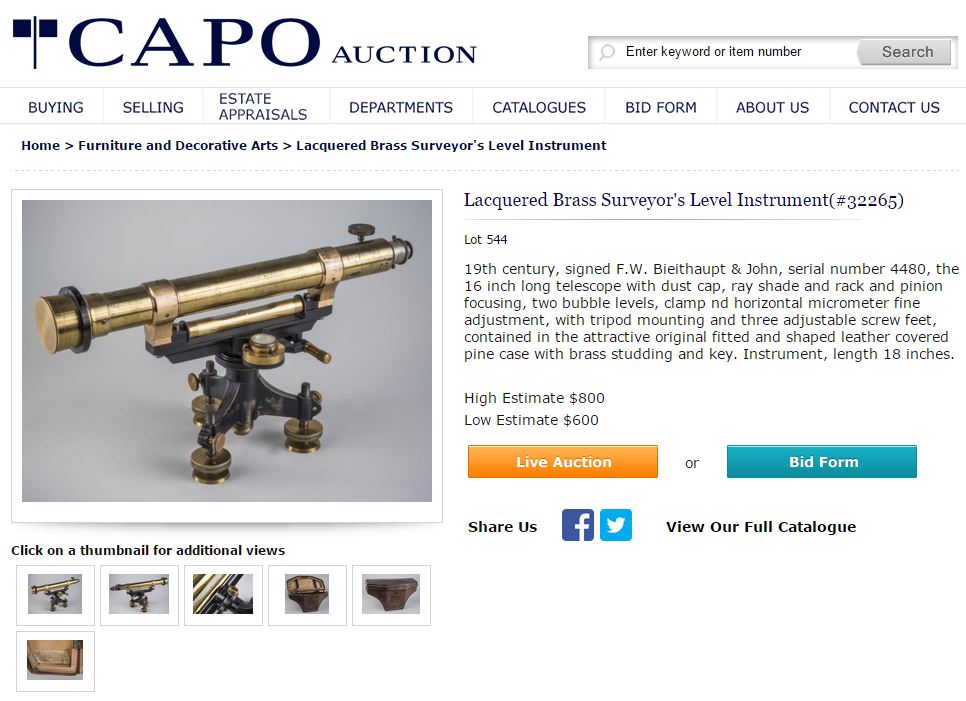
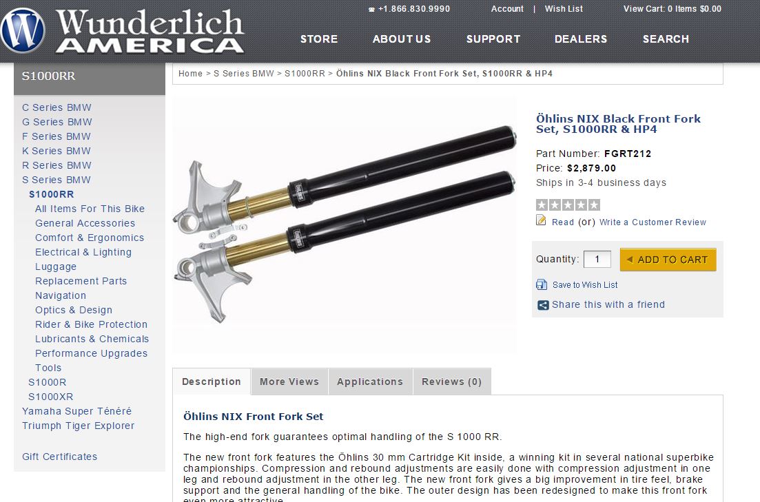
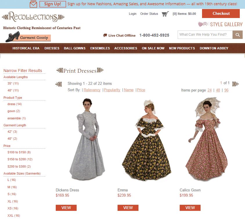
    DO have multiple views of your product: Your customers will want to know exactly what your product looks like from every angle. Choosing images of your product that offer something new and different from each viewpoint will give your buyer an idea of what they are purchasing, and they will feel more confident in their decision to complete their order. If you are selling clothes, show them being worn by a model in order to give customers an idea of what the product looks like on a “real person” versus a mannequin.

    DON’T leave your customers with questions: Having quality product descriptions will help you sell your product tenfold. By providing overviews of your products that are honest without being negative, the option to see customer reviews, and the option of asking a staff member, you build trust in your site and the customer feels at ease.

    DO have a bold call to action: Your call to action is perhaps the most important part of your e-Commerce design. If your site doesn’t give customers a way to buy your product that is visible and enticing, your e-Commerce design isn’t doing its job. By creating a bold “Add to cart” or “Buy now” button, you’ll make it easier for your customers to find their way into your site’s checkout process. Remember, your visitors will look for the first reason to click away from your website. Don’t give them a reason to do so simply because they grow frustrated trying to complete their purchase.

    DON’T waste your customer’s time: Clicking in and out of pages can become tedious and cumbersome for consumers. If you want to retain more customers, implementing a “quick-view” feature that allows them to see a product’s complete details without having to navigate away from their current category or search results page is a great way to improve a customer’s experience. This will hold the customer’s attention longer and keep them from exiting your site.

    DO talk to your customers: Having conversations with customers can yield feedback which proves more valuable than some of the most robust analytics tools available. Opening up direct dialogues with your customer base unearths difficulties or frustrations they encounter that they may otherwise not express as well as helps to build your rapport. Giving customers the option to subscribe to a newsletter, review a product, or contact you with questions will help strengthen relationships with them and promote repeat business.

    DON’T create a complicated checkout process: The biggest eCommerce conversion killers are abandoned shopping carts, which happen for a number of reasons. If you want your customers to stay with you all the way through the checkout process, make it easy. Only include what you need in your shopping cart and make sure you are prepared for a streamlined multi-channel sales experience. Use a POS card reader that connects to your online store for offline sales for optimized transactions across all channels.

    Here at 216digital, we build websites and help online businesses grow. These are just a few of the tricks we have up our sleeves, and we want nothing more than to see your online business reach its full

    Greg McNeil

    March 3, 2015
    Web Design
    ecommerce design
  • The Basics of Responsive Web Design

    The Basics of Responsive Web Design

    Implementing a responsive web design can have a tremendous impact on the overall custom experience your site offers. As consumers rely more and more on phones, tablets, and other mobile devices to stay informed, stay connected, and shop, it’s more critical than ever that your site utilizes a design that is easy to use on any device. Customers will look for every reason to exit out of your webpage, and if your website is difficult to navigate from a phone, they won’t stay long enough to buy anything and they won’t recommend it to their friends. That’s why making your website as user friendly as possible will work to your benefit, and 216digital is here to help you make it happen.

    The mobile view a user experiences on 216digital's site.
    The mobile view a user experiences on 216digital’s site.

    Here we’ve gathered together some reasons why you should seriously consider making your website responsive:

    1. Make sure your customers don’t tap dance: One of the most frustrating parts of using a website that isn’t optimized for mobile devices is the tapping and zooming you have to do to get to the content you want. To make things as easy and enjoyable as possible for your customers, you’ll want to make sure that your website’s images and content are properly presented and don’t require the customer to manipulate their device in some awkward fashion in order to make use of it.

    2. Make sure your website rankings don’t suffer: Google Webmasters recently released an article stating that “We see these [mobile friendly] labels as a first step in helping mobile users to have a better mobile web experience. We are also experimenting with using the mobile-friendly criteria as a ranking signal.” This means that your website could be hit hard in the coming years if it isn’t mobile friendly. Future-proof your website and don’t be left in the dust!

    3. Always think of the customer: Responsive web design isn’t just for customers using smaller, handheld devices. It should also scale-up and conform to fit the screens of larger devices, like televisions, that customers might be using through their gaming systems or other peripherals. By keeping the quality of your customers’ experiences a priority, you’ll be sure to have a website that will respond to all of their needs, no matter the device they are using.

    4. Leave the reading glasses at home: If your website isn’t optimized, many times the text is either much too large or way too small to be read easily. And, remember, your customers might be using a larger screen, like a TV, but sitting further away and still not able to read what’s on your site. The whole point of your website is to make it effortless for your customers to breeze through checkout when they decide to buy your product. So, if the site’s text is too small to read, that complication will not bode well for your bottom line. Making sure your text is readable is crucial to success.

    The desktop view a user experiences on 216digital's site.
    The desktop view a user experiences on 216digital’s site.

    216digital is here to simplify this whole process for you. Responsive web design is not only helpful, but in light of the ever-widening array of web-enabled devices available to consumers, it’s become absolutely essential. Nonetheless, it can also be time consuming and cumbersome to learn, which is difficult while trying to manage your online business. Let 216digital take responsive web design off your list of worries. Our team of expert designers knows exactly how to build your website to respond to whatever size screen your customers are using, so that you can entice them, no matter the device. Check out some of our work—we think you’ll like what you see.

    Greg McNeil

    March 2, 2015
    Responsive, Web Design
    responsive web design
  • The 7 Most Important Pitfalls to Avoid with Your New Ecommerce Website

    The 7 Most Important Pitfalls to Avoid with Your New Ecommerce Website

    There are so many different pieces that must all work together in order to launch a successful eCommerce website. Without careful planning, even an experienced developer can run into trouble. Here are 7 of the most common pitfalls and tips on how planning can help you avoid them:
    1. Choose the right platform. It’s tempting to pick the platform that “everyone uses” but everyone isn’t you. Take the time to evaluate the different platforms on the market and find the one that best suits your actual needs. Some platforms have large third-party support that can add to any functionality you need. Use one of the many online comparison tools to determine which software is most powerful, customizable, or easiest for you to learn. Also, keep in mind that it all comes down to the customer experience. If your site doesn’t make their shopping effortless, they’ll probably be less inclined to spend their money with you. Don’t go overboard with shipping and checkout options, keep as few choices as possible within reason. Otherwise, you run the risk of overwhelming them and turning them off from doing business with your company.
    2. Lock down your data. Even if you have the most robust and secure eCommerce platform, using it without a dedicated SSL or a digital certificate is like not locking the door to your house. Many smaller web stores don’t think to implement them or use a shared SSL certificate, usually because of cost concerns. Not having an authoritative declaration of security can impact the trust the customer is willing to place in your business. In today’s online economy, third-party digital certificates can be had quickly and well within budget and go a long way in assuring the customer that their data and money is safe.
    3. Make it easy to find. Customers will look for the first opportunity to click off your site if they can’t figure out how to navigate it quickly. Make your menus intuitive and minimize the number of clicks your customers need to make to find what they are looking for. Make sure you also include search bar functionality in case your customer isn’t sure in which category the product they need is listed.
    4. Make it look nice. Even the best eCommerce sites lack the ability for the customer to physically examine the product they are shopping for. To make up for this, you need excellent imagery that shows multiple angles and any different options that are available. Also make sure that any imagery looks good on a mobile browser or smartphone, which brings us to…
    5. Optimize for the road. Every year, a larger and larger percentage of online shopping is being done from smartphones and tablets with mobile browsers. If a shopper has a bad experience using a poorly designed mobile site, they won’t recommend it to other potential customers and are also much more likely to immediately visit a competitor’s site. Keep in mind, though, that optimizing for mobile platforms doesn’t mean making your design look “just ok” on a phone, you need a plan and design that works perfectly within the mobile browser.
    6. Content is king. Using stock descriptions from the manufacturer of the products you sell makes it difficult to differentiate yourself from other eCommerce sites that sell the same things. Unique content helps with your SEO ranking as well. Like the use of good imagery, a compelling and comprehensive product description gives your customer another layer of experience and allows them to easily become familiar with the product and much more likely to buy.
    7. Tell them who you are. It may seem obvious, but make sure you include contact information so that your customers can reach you if they have any questions or problems with their shopping experience. It can be as simple as a phone number at the top of the site or a robust page with a contact form. If you use email or a voicemail service, make sure someone checks it regularly. It can help you salvage a sale and create a customer for life that you might otherwise lose if they feel like they were left high and dry. And keep your branding consistent. If you don’t have money to invest in a branding package yet, use Hatchful to create one for free, in a matter of minutes, from your phone.

    At 216digital, we can help you completely avoid these problems or find a solution for you if you’ve already encountered bumps in the road. Our on-site developers and creative designers have over 15 years of experience in building eCommerce sites and creating custom integrations from the ground up. We use best practices gained from years of experience to craft industry-leading websites with unparalleled usability that convert browsers to buyers for our clients.

    Greg McNeil

    March 1, 2015
    Web Design
    ecommerce website
  • The 9 Biggest Mistakes in Ecommerce Design

    The 9 Biggest Mistakes in Ecommerce Design

    The design of your ecommerce website is a critical piece to your marketing strategy and it’s what drives your brand identity on the web. Think about it: you’d put a lot of work into making your brick-and-mortar storefront look and feel just right to represent what your business is about, so why wouldn’t you do the same for your online storefront? It’s just like another layer of packaging to your product; it should highlight and emphasize the items you’re selling and make them more appealing to your customers.

    But there’s plenty of ways that design mistakes can be made, especially for new ecommerce sites and redesigns of older ones. I’ve compiled a list below that looks at some of the most common mistakes that I’ve come across in ecommerce design. They’re separated them into three categories: Usability, Layout, and Graphics.

    Capo Auction provides excellent photography of all of the items they offer in their monthly auctions.
    Capo Auction provides excellent photography of all of the items they offer in their monthly auctions.

    Graphics

    1. Bad photography. This is incredibly important, so I’m leading off with it. It’s pretty simple: bad photography can sink your site. Your customer is giving up a lot when they shop online. In a physical store, they can handle and touch the product, look at it from every angle, and compare items side by side. If you’re selling items that rely on their look or design, you need to make sure that your customers can see exactly what the item is about. Take pictures from multiple angles, show the tag or label, highlight details, show items in context, and don’t leave any question about what the item looks like. But that doesn’t mean to make your pictures look boring or clinical like an eBay auction. Create some emotion surrounding your product and show how desirable the lifestyle is that goes along with your product.

    2. Only one resolution for your images. This goes along with the tenants of responsive ecommerce design that I’ve gone into some depth on in another article. It’s a detail that often gets overlooked, though. In responsive ecommerce design, the site needs to scale to fit whatever size screen it’s being displayed on. Sometimes the images get overlooked and are not made adaptable. The larger an image is, the longer the load time (which is another item I’ll address below). There are plenty of plug-ins for your platform, along with CSS and new HTML5 tricks like the “picture” element that can serve the image up correctly no matter what device it’s on.

    3. Unclear Call-To-Action buttons. This goes for any size screen but is especially important in responsive design. If your button doesn’t stand out or can’t be found because it blends in to the background or is tucked off to the side, it won’t be very effective in converting customers. If it’s hard to use because it’s too small on a mobile screen, then it’ll frustrate visitors and they’ll quickly leave and drive up your bounce rate. Also, keep in mind that many more laptops are coming equipped with touch screens now. Make your buttons finger friendly and easy to see.

    Great example of a clean, concise layout, that displays the product well with a clear call to action on Wunderlich America's website.
    Great example of a clean, concise layout, that displays the product well with a clear call to action on Wunderlich America’s website.

    Layout

    1. Cut the clutter. You see it all the time on ecommerce sites – too much junk that distracts from the important things. If the advertising banner is the first place your eye is drawn rather than the product or company logo, there is a problem. Create a visual hierarchy with the elements on your home page. The places you want your visitors to go first or the places that are the most important need to stand out the most. Carry that design all the way down through the least important aspects of your site.

    2. Making your design too radical. You don’t need to reinvent the wheel, here. Being different in your ecommerce design just to be different is a recipe for disaster. There is a long (well, relatively long) history of web design convention that shouldn’t be ignored. Customers have expectations on how to add an item to their order, how to find your contact information, and how to sort categories. While you’re at it: practice consistency across your entire website. Keep colors the same across all your pages. It makes it difficult when you’re looking for a blue button on one page, and a pink one on the next, meanwhile the links have changed color. When you throw something brand new at your visitors, you give them a learning curve that makes them work harder just to spend their money with you.

    3. Non-responsive email. Everybody always forgets about the newsletters! Most newsletters are written and displayed as webpages and with the proliferation of mobile messaging, having a responsive design is important. If you’re customer can’t read your email or needs to zoom all around just to see what’s there they probably won’t read it and will stop opening them all together. Then it’s like you never converted them in the first place. Also, keep them light on information. Nobody wants a digest in their email; they want a flyer that they can glance at and get the information they need.

    Recollections does a great job making their website easy to navigate and to find their products.
    Recollections does a great job making their website easy to navigate and to find their products.

    Usability

    1. Slow loading mobile sites. Here it is again: responsive design! It’s a given that mobile users want their information quickly. Even though it may seem unrealistic for a signal that bounces around the world, a delay of just a few seconds can cause the visitor to abort the page and leave for somewhere else. Keep the pages lightweight on content. If they absolutely need more, see if you can separate it into another tab. Keep your graphics lightweight, too (See item 2 in Graphics). A good responsive design will only use the necessary resources to display the site correctly and will load much quicker.

    2. Products are hard to find. If a customer gets frustrated trying to find the specific item they want, they will leave and it may be very hard to recover that sale. Offering a quick and easy way to navigate through categories or direct to an item is a great way to make the customer experience effortless. There are plenty of other ways to do this too: have a (good) search bar, make sure your product SKUs are correctly categorized, and be sure that your products can be filtered at every step of the shopping process.

    3. Account requirement. You don’t need to sign-up for the newsletter or give all sorts of information when you make a purchase in person, right? Don’t require customers to create an account when shopping with your company either. Plus, what if they’re just comparison shopping and don’t want another newsletter in their email just because they wanted to look around. Account fatigue is real!

    Instead of requiring account creation, offer to save their shipping and billing information after the sale if they choose. Once the sale is complete, creating an account is no longer an impediment to the sale and the customer may be more likely to let you sign them up. There is now a perceived value because they get to keep in contact with a company that they have already invested with. Data collection is important in ecommerce, but making the sale is a far higher priority.

    Greg McNeil

    February 27, 2015
    Web Design
    ecommerce design
Previous Page
1 … 3 4 5

Audit Your Website for Free

Find Out if Your Website is WCAG & ADA Compliant