Lower Antelope: Webite Redesign
Stunning design showcases the beauty of Lower Antelope Canyon
Lower Antelope Canyon: An Unforgettable Experience
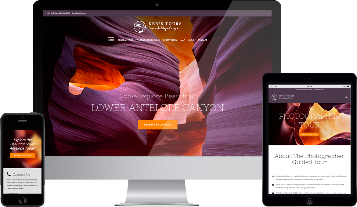
Ken’s Tours offers guided excursions into Lower Antelope Canyon. As sunlight moves across it throughout the day, this stunning natural wonder displays a wide range of colors and textures. Lower Antelope Canyon is a totally immersive experience. When Ken’s Tours approached us about building a new website, we knew the site had to be just as immersive as a tour in the Canyon itself.
We allowed the Canyon to guide all our design decisions. Working closely off a set of high-resolution photographs, we chose an understated color scheme derived entirely from the colors found in the Canyon. We let the large banner images take first place in the design hierarchy. Minimalistic typography allowed us to maintain that hierarchy across all parts of the site, and a custom logo based on the curvature of the Canyon provided the perfect branding accent.Killer photographs + a professional design eye = stunning results.
Photographs of Lower Antelope Canyon say it all. The place is a natural wonder, and we realized that the best way to sell tours there was to showcase that beauty. With high-resolution photographs sourced directly from the client, we built up a visual experience that’s firmly rooted in the Canyon’s beauty yet remains simple and functional across all devices.

Professional logo design: Capturing the Canyon’s spirit in a flexible, functional graphic.
Not only did we build the new Lower Antelope Canyon website, but we created a new, custom logo that captures the wild beauty of the canyon. The client requested a graphic device that imitated The Lady in the Wind, an iconic rock formation in the canyon that looks like a woman with a veil streaming out behind her head.
We designed the logo to capture this sense of motion while also looking great on both desktop and mobile. We achieved this through careful proportioning and control of all design elements. In particular, we chose a horizontal format to ensure the logo would scale well on mobile and tablet.
New website = new era.
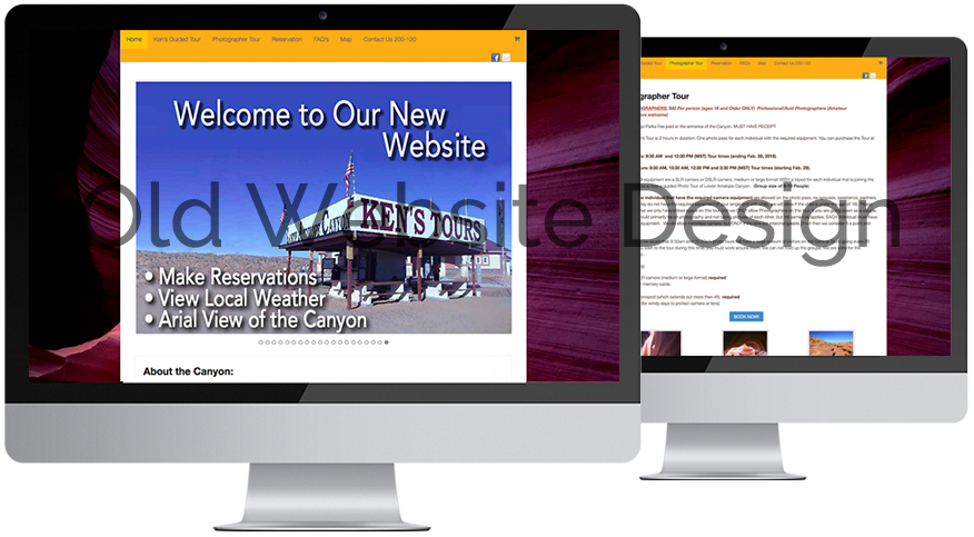
The old Lower Antelope website served Ken’s Tours for years. At the time of its creation, it was truly cutting-edge. However, it wasn’t mobile-responsive, and the client’s customers found the website difficult to use on mobile and tablet. It was high time to build something new.
The old website also didn’t sell the stunning beauty of Lower Antelope Canyon as much as it could. The photographs were there in the background, but they were just that—background. The design didn’t center itself around the photographs. This created a non-immersive experience for potential customers.

A custom map: Crucial to helping customers find their destination.
As good as Google Maps. Actually, better.
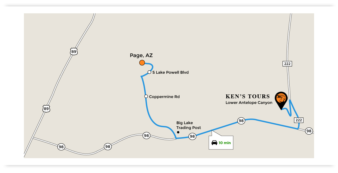
Google Maps is fantastic, and we appreciate how easy it is to embed a Google map in a website. However, in the case of Lower Antelope, a set of coordinates from Google Maps wasn’t good enough. The client needed a custom map.
Many people asked how to get from Page, AZ to Ken’s Tours. Google Maps could tell you—but there was an added complication: Ken’s competitor is right next door! This led to confusion, and customers who wanted to go to Ken’s Tours often ended up at his competitor without realizing it. The solution? A custom map which clearly displays the location of Ken’s Tours AND provides the level of detail which we usually get from Google Maps.
Ready for your company to Stand Out?
Let’s get started!Stunning photography: The core of Lower Antelope’s look and feel.
Natural beauty, captured in digital photographs, guided all design decisions.
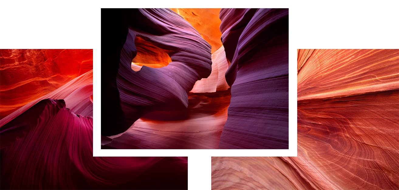
Lower Antelope Canyon is a design masterpiece. The fluidity of lines and the high contrast between dark and light are absolutely stunning. At different times of the day, different angles of reflected sunlight produce different colors and accents on the curving walls and rock formations. No two photographs from the Canyon ever look the same.
We allowed these photographs to guide all of our design decisions. We left white space where appropriate so as not to crowd the photographs. We chose colors directly from the pictures, and we designed a logo which subtly mimics the sweep of the rock layers.
The Bottom Line
For Ken’s Tours, showcasing gorgeous photography was a no-brainer. Nothing could represent Lower Antelope Canyon better. The large photographs load quickly, and the site offers a clear call to action. This is a great improvement over the old Lower Antelope website. It helps Ken’s Tours convert more site visitors into customers. That means more people get to enjoy the stunning views in Lower Antelope Canyon.