Artificial Plants And Trees: Website Redesign
Sleek user experience sets new standard for independent ecommerce stores.
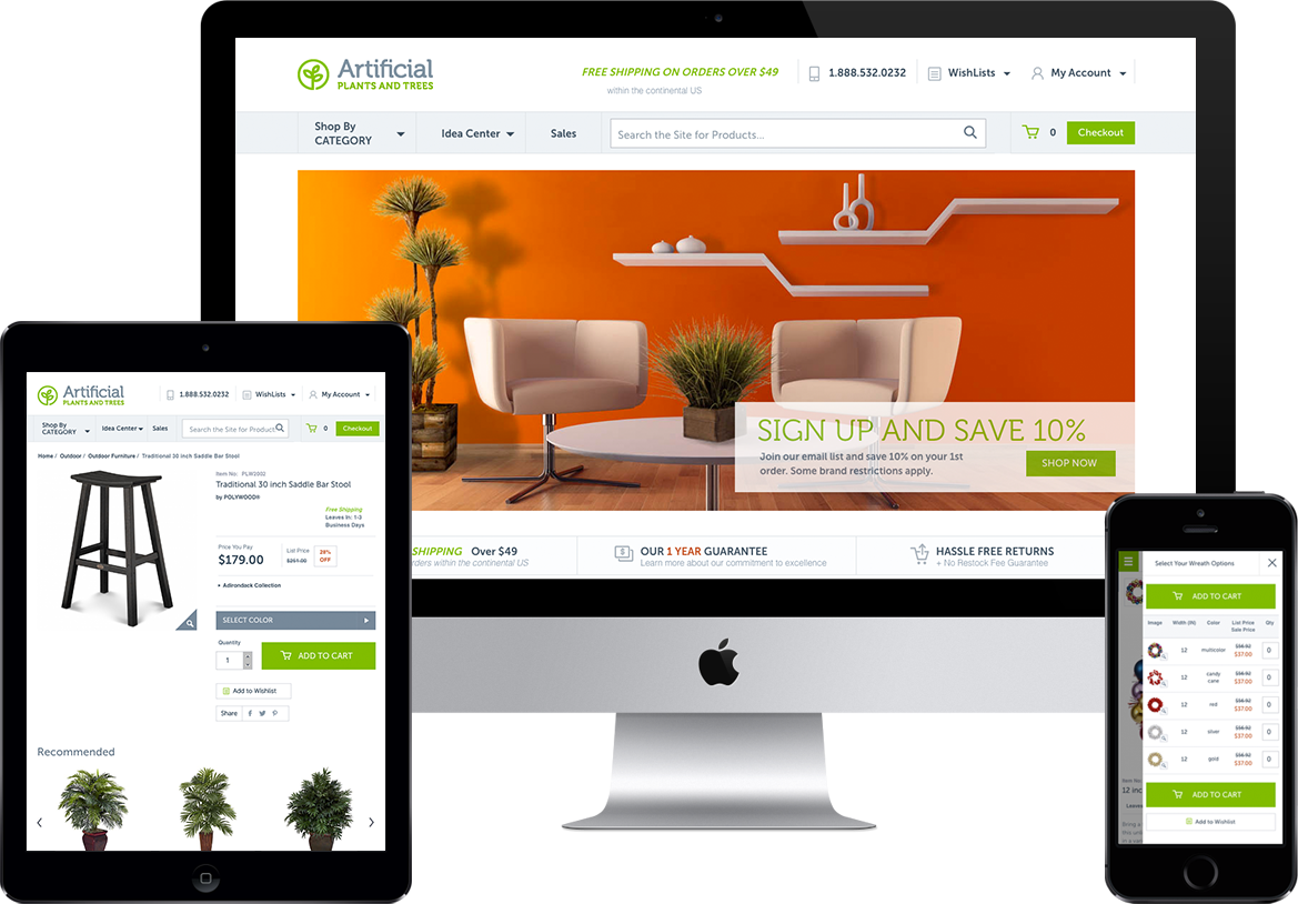
Artificial Plants and Trees has one mission: to help customers create beautiful, low-maintenance homes and offices. To that end, they sell faux trees, plants, and topiaries, as well as indoor and outdoor furniture. Their catalog is vast and complex—30,000 customer-facing SKUs and over 150,000 product variants.
The problem? Owner Doug Hopeman put it this way: “We weren’t mobile-friendly. We needed to take a mobile-first approach to our design.”
In today’s ecommerce market, mobile-friendly design is a must. That means stripped-down navigation and simple, intuitive user experience. How do you marry 30,000 SKUs and 150,000 product variants to a mobile-friendly design?
Glad you asked.
Let’s face it: independent ecommerce is tough. There’s always someone bigger who ranks above you (and probably sells in more niches than you do). In the age of Amazon and mobile shopping, users expect intelligent stores that work flawlessly on mobile. That’s a tall order for the niche ecommerce entrepreneur.
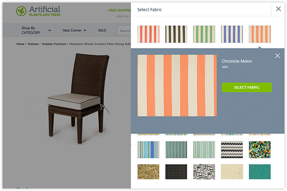
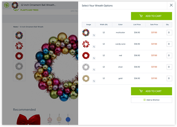
The new Artificial Plants and Trees website features powerful technology to streamline and improve user experience.
Sometimes, a user is ready to browse, but not ready to buy. Rather than force users to the next stage in the buying journey, why not let them move at their own pace?
To facilitate this, we created a simple wishlist account signup. To build a personal wishlist, a user enters their email and creates a password—nothing more. This benefits the customer by making wishlist creation incredibly easy. It benefits Artificial Plants and Trees by tying product preferences to an email account. As customers return to the site, the built-in smart recommendation algorithm gets more and more data to work with in suggesting related products. More on that below!
Amazon’s product recommendation algorithm provides customers with incredible value. By and large, it does a great job of understanding the types of related products which the user might like. This is a huge competitive advantage in the ecommerce world.
Luckily, companies like 4-Tell make this kind of marketing intelligence available to independent e-retailers. 4-Tell’s algorithm predicts which products customers are likely to buy in tandem. With these smart recommendations integrated into the new site, Artificial Plants and Trees benefits from a user experience that is organized around each individual user. Recommended products are chosen by powerful marketing AI.
Inventory transparency is critical to the independent ecommerce store. Since they can’t handle and see the actual product they’re buying, ecommerce buyers have a fundamental anxiety: maybe the product listing and seeming availability are a lie. When a product is in stock, displaying live inventory helps dispel these worries. When the product is out of stock, this transparency saves the buyer from developing unrealistic expectations. It also invites the buyer to contact the seller and ask when the item will be back in stock, opening up personal lines of communication which can establish a new relationship.
On desktop and large tablet screens, the slim header appears when the user scrolls. We made judicious use of real estate: the slim header displays the store logo (which links to the homepage), the product name, and the price. Nothing more—until the user scrolls past the on-page Add-To-Cart button, at which point that button pops up into the slim header. Everything happens smoothly, without jerkiness.
This feature allows users to browse the product description and options without losing track of which product they’re looking at. It also allows them to add the product to their cart from anywhere in scroll.
On mobile, everything is rearranged to create the most intuitive browsing experience. A floating mobile-only menu ensures that site navigation is only a tap away. The most important assets load first on mobile: the product name, imagery, price, and Add-To-Cart button.


In ecommerce, every design choice must support the end goal of getting conversions. Unnecessary points of friction MUST be eliminated.
-
Reduced Navigation Options in Checkout
Showing too many navigation elements too far down the conversion funnel actually distracts from closing the sale. Why show the user catalog and wishlist buttons when they have nearly committed to buying?
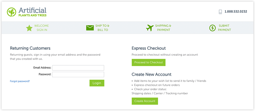
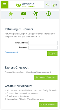
We implemented a streamlined navigation for the end of the conversion funnel. After clicking “Proceed to checkout,” the customer sees a highly simplified interface that is entirely dedicated to checking out. In place of a navigation panel, the customer sees checkout progress milestones the spell out exactly where he or she is in the process. This reinforces buyer confidence and simplifies the checkout experience.
-
Automatic Card Type Detection
Intelligent card type detection eliminates one small point of friction. We coded the checkout to identify card type based on the number alone. This helps to streamline the checkout process.
-
Customer Address Book
We integrated a customer address book feature. This allows customers to save multiple shipping addresses and select one at time of checkout, just like on Amazon. That means less friction for returning customers.
At 216digital, we understand the importance of content marketing in a way that many other agencies don’t—because we offer these services ourselves.
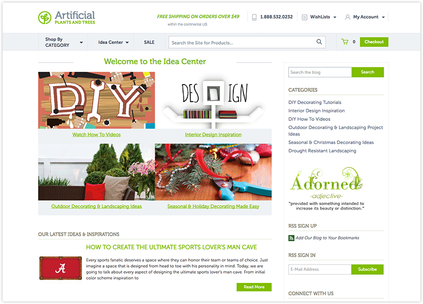
When it came to building the Artificial Plants and Trees blog, we understood the importance of marrying blog branding on the customer-facing site with ease of use in the backend. We created a WordPress installation that fits seamlessly into look and feel of the rest of the site. Looking at the public-facing blog, you would never know that it runs on an entirely different platform than the ecommerce store.
Best of all, customers can still reach the store from the blog, since we displayed the same menu in both places. Plus the blog is easy to update from the backend, requiring no knowledge of coding.

Unfortunately, anyone can throw an ecommerce store onto a server and take payments. Without any type of third-party verification, customers are on their own determining which vendors are reputable.
Luckily, Google helps reputable online retailers with its Trusted Store badge. We integrated a small Google Trusted Store card into the bottom right corner of the site. When users click this button, they see the average star rating which Artificial Plants and Trees receives in Google Reviews. This trust mark is critical to cementing the store’s legitimacy in the minds of customers.
Doug talks about his experience working with 216digital. “You guys have been great. You’re pretty buttoned-up… You guys have been pushing hard, and I’m happy with the results. We had good communications and a good outcome.”
“We had good communications and a good outcome.”
Can you achieve this with your store? Absolutely! “We’re not a big company,” Doug says. “We’re a small company. We’re trying to compete with the big boys and get people to make buying decisions.” The powerful technology which we built into Artificial Plants and Trees establishes that competitive edge. It’s more attainable than you might think.
What are you waiting for? If you’re ready to take your ecommerce store to the next level, get in touch today. Let’s start talking about your next big thing.
