Koi Market: Responsive Website Design
A website as unique as Koi
Building the Koi Market
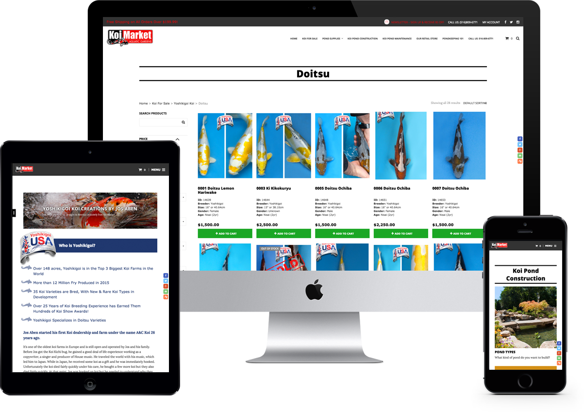
Koi (Japanese Colored Carp) are beautiful and graceful fish and a welcome addition to any pond. The diversity in their appearance, size, and shape make almost every koi unique. This principle is what guided our efforts in the redesign of the Koi Market Website.
In the fall of 2014, the owner of Koi Market Construction & Maintenance Inc., Shawn Rosen approached 216digital to embark upon a website redesign. At the time, the Koi Market website was static, chock-full of stock imagery, and built on an obsolete platform: eBay’s ProStores. Additionally, pond construction and maintenance, the primary parts of the Koi Market Construction & Maintenance business had no real presence or promotion online! Through further dialogue and analysis, we came up with a plan to get Koi Market Construction & Maintenance on the map. The first course of action was to determine the best ecommerce platform for Koi Market to grow their online business. Koi Market had two distinct requirements: their new site needed to generate national online sales, and equally important, it needed to create local pond maintenance and construction leads in the New York / New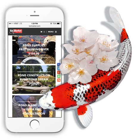 Shawn wanted his staff to have the ability to easily add and remove koi supplies and fish for sale worldwide and he wanted it to be easy for his customers to use and submit leads as well. Shawn wanted to go with a platform that was simple and streamlined easy to update, and with a large community of third party developers.
Building the Koi Market
With this knowledge, we determined that starting with WordPress as the base platform and the WooCommerce extension for the ecommerce storefront was the best bet for the future of his online business. With WooCommerce, Shawn could manage his ecommerce store while WordPress would fulfill the need for an easy to use content management system. Together, WordPress and WooCommerce made the addition of new pond services, and pond construction examples very easy to manage. Additionally, WordPress would make it very easy to add new site content without the need to know HTML or CSS. In the final analysis, we determined WordPress and WooCommerce would provide an excellent platform to meet the current requirements for Koi Market and, with the large community of developers, could accommodate just about anything that could arise in the future.
Our goal: Make the website distinctive, stunning, and one of a kind, just like every koi fish. Surprisingly, prior to Koi Market’s launch, there were no great websites in Koi Market’s niche that had ever achieved this.
 Anytime you have a product or service to sell that is defined by its beauty, it is absolutely essential to showcase it with an equally beautiful design. Our team knew that in order to separate Koi Market from the competition, we needed the right set of ingredients. That meant we required a combination of amazing koi and pond construction photography, a cutting edge design, and responsive functionality. Shawn came through with the first item, making our job as designers and developers much easier. Having high quality graphic assets and photography is the one of the most overlooked parts of a new website design. Without good imagery, there is only so much lipstick we can put on that pig!
Ready to build Something Amazing?
Let’s get started!
In addition to great images, there were many other requirements that needed to be addressed in the website redesign. First, the Koi Market website needed to be easy for their customers to use on whatever device they chose, and second, it needed to be Search Engine friendly. For both of these reasons, the decision to go with a responsive website was a no brainer. This also meant we had to set up proper redirects from the old website, construct short URLs, build unique meta tags, optimize the site speed, and so much more.
With all of the resources that we required at hand, it was time to get to work. First, we tackled the global elements of this project. That means getting the header, footer, and navigation just right. Next, our designers focused on the home page of the website. This page needed to quickly convey to the public exactly what services and products that Koi Market offered. With this in mind, we created four distinct and eye-catching calls–to-action at the top of the website: Koi Fish, Koi Supplies, Pond Construction, and Pond Maintenance. After that, there is an area dedicated to the latest news, events, and articles in the Koi World.
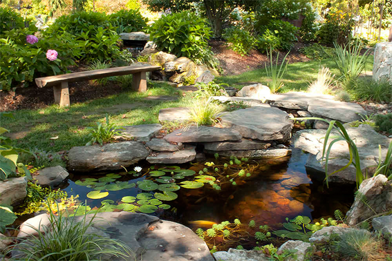

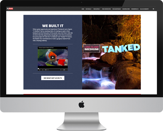
Next, our developers utilized a Parallax effect to show off one of Shawn’s most amazing pond builds: the Caputo Project. This specific photo and area is dedicated to the Pond that Koi Market constructed for the Television Show Tanked!
 The new Koi Market Construction & Maintenance website is much more useful, it’s also much better looking and really showcases the beauty in the koi products they sell. Whether their customers are looking at new koi fish to add to a pond, inspiration for a new pond construction project, or tips and tricks on owning a koi pond, Koi Market has the answers all within an attractive package. Like each koi fish, the new Koi Market Construction & Maintenance website is really one of a kind. While it does everything you would expect from a state of the art ecommerce site, the presentation is what really sets it apart. We are proud to have developed this great new site for Shawn and the staff at Koi Market Construction & Maintenance, and we look forward to partnering with them in the future to continue growing their online business.
 The new Koi Market Construction & Maintenance website is much more useful, it’s also much better looking and really showcases the beauty in the koi products they sell. Whether their customers are looking at new koi fish to add to a pond, inspiration for a new pond construction project, or tips and tricks on owning a koi pond, Koi Market has the answers all within an attractive package. Like each koi fish, the new Koi Market Construction & Maintenance website is really one of a kind. While it does everything you would expect from a state of the art ecommerce site, the presentation is what really sets it apart. We are proud to have developed this great new site for Shawn and the staff at Koi Market Construction & Maintenance, and we look forward to partnering with them in the future to continue growing their online business.