Imagine trying to explore a website but not being able to get the information you need because the site wasn’t made with you in mind. For many people with disabilities, this is a frustrating reality.
Web accessibility isn’t just a technical requirement—it’s about making sure everyone can use your website. Whether you’re a developer, IT director, or content manager, making your website accessible is essential. By fixing common accessibility problems, you not only meet legal standards but also make your site better for everyone.
Let’s dive into the top 10 web accessibility issues and how to fix them.
1. Missing Alt Text for Images
Alt text, or alternative text, is a brief description added to images on a website. It helps people who can’t see the images understand what they are about, as the alt text is read aloud by screen readers or displayed if the image doesn’t load. When alt text is missing, people with visual impairments miss out on important information, making the website less accessible. This can lead to frustration for users and might even cause legal issues, as websites are expected to be accessible to everyone.
According to WCAG 2.1 SC 1.1.1 (Non-text Content), all non-text content, like images, needs a text alternative that serves the same purpose or provides the same information.
How to Fix:
- Add Descriptive Alt Text: For each image, write meaningful alt text that clearly describes what it’s showing or its purpose. For example, instead of just saying “Image of a dog,” say “Golden Retriever playing in a park.”
- Use Empty Alt Attributes for Decorative Images: If an image is just decorative, use an empty alt attribute (alt=””). This way, screen readers skip over these images, making navigation easier for users.
- Review and Update Regularly: Regularly check your alt text to make sure it’s still relevant, especially if you update the images or content on your site.
For more information about Alt text for images, check out our article Understanding Image Alt Text Descriptions.
2. Web Accessible Forms
Forms that are not web accessible can be a big problem for people with disabilities. When forms are not designed with web accessibility in mind, they may be hard to understand or use with assistive technologies like screen readers. For example, if a form doesn’t have clear labels or instructions, someone using a screen reader might not know what information to put in the fields. This can make it difficult or even impossible for them to complete the form.
WCAG 2.1 SC 1.3.1 (Info and Relationships)requires that the information and relationships between form elements be clear and properly coded so that assistive technologies can read and interpret them correctly.
How to Fix:
- Label Form Elements Clearly: Use the <label> tag to connect labels with each form field. This helps screen readers explain each field’s purpose. For example, use <label for=”email”>Email Address</label> with <input type=”email” id=”email”>.
- Provide Accessible Error Messages: Make sure error messages are clear and easy to understand. Use ARIA attributes like aria-live to alert users to errors and make sure screen readers can easily read the messages.
- Include Clear Instructions: Give clear instructions for filling out the form, especially for fields with specific requirements like date format or password criteria.
3. Poor Color Contrast
Low color contrast between text and background can make content hard to read, especially for users with visual impairments or color blindness. For example, light gray text on a white background is hard for many users to see.
WCAG SC 1.4.3 (Contrast – Minimum) requires a contrast ratio of at least 4.5:1 for normal text and 3:1 for large text to meet web accessibility standards.
How to Fix Color Contrast:
- Check Contrast Ratios: Use online tools like WebAIM’s Contrast Checker to make sure the color contrast between text and background meets accessibility guidelines. Aim for a contrast ratio of at least 4.5:1 for normal text and 3:1 for large text.
4. Missing Keyboard Navigation
Web keyboard navigation is a way for people to use a website just by pressing keys on their keyboard, instead of using a mouse. This is important for people who can’t use a mouse, like those with certain disabilities.
When a website doesn’t support keyboard navigation, it means that users who rely on keyboards might not be able to access all parts of the site. This is a problem because it makes the website more challenging to use for people with disabilities.
According to WCAG SC 2.1.1 Keyboard, websites need to be fully navigable using just a keyboard. This means that all buttons, links, and forms should be reachable and usable without a mouse. If a site doesn’t meet this standard, it can exclude many users and make it less accessible.
How to Fix:
- Enable Keyboard Navigation: Ensure that all interactive elements, such as links, buttons, and menus, can be accessed using only a keyboard. This includes allowing users to tab through items and activate them using the Enter or Space keys.
- Implement Proper Tab Order: Use the tabindex attribute to manage the order in which elements receive focus when tabbing. Avoid skipping focusable elements or creating confusing navigation paths.
- Use Focus Management: When interactive elements like modal dialogs or dropdown menus open, move the focus to the first interactive element within the component, and return it to the triggering element when the component closes.
5. Video and Audio Captions
Videos and audio content that lack captions or transcripts are inaccessible to users who are deaf or hard of hearing. Without captions or transcripts, these users miss out on the audio information provided in multimedia content.
WCAG SC 1.2.2 Captions (Pre-recorded) mandates that videos and audio content include captions to assist users who are deaf or hard of hearing. Without captions, these users may miss crucial information, making it more challenging for them to grasp or engage with the content fully.
How to Fix:
- Provide Captions: Make sure your videos include captions that match what people say. Start with tools like YouTube’s automatic captions, but edit them manually to ensure accuracy.
- Create Transcripts: Give users transcripts for your audio content. A transcript is a written version of what’s said in a video or audio file, including important sounds. Users can read these transcripts or use them with text-to-speech tools.
- Make Captions and Transcripts Available: Allow users to turn captions on or off and offer transcripts for download. This gives people the choice to use captions or read the text in a way that works best for them.
6. Missing Skip Links
Web accessible skip links are special links on a website that let people quickly jump past repetitive content, like navigation menus, to get to the main part of the page. This is especially helpful for people using screen readers or keyboard navigation.
If a website is missing these skip links, it can make it much harder for users to navigate, which goes against WCAG SC 2.4.1 Bypass Blocks.” This helps users quickly get to the content they need, reducing the effort required to access important content.
How to Fix Skip Links:
- Add Skip Navigation Links: Place “skip to content” links at the top of your web pages. These links should be one of the first elements in the tab order, allowing users to bypass repetitive navigation and go directly to the main content.
- Make Skip Links Visible: Ensure that skip navigation links are visible when focused. Use CSS to make them visually prominent when selected by a keyboard, so users know where they are skipping to.
7. Unclear Headings and Structure
Poorly structured headings can make it difficult for users with screen readers to understand the organization of the content. For example, if headings are not used correctly or if they are missing, users may struggle to comprehend the hierarchy and flow of the information.
WCAG SC 1.3.1 Info and Relationships requires that content structure and relationships be programmatically determined or available in text. Proper use of headings and a clear content structure ensure that users can navigate and understand the content more easily.
How to Fix:
- Use Proper Heading Tags: Implement <h1>, <h2>, <h3>, etc., in a logical order to reflect the content’s structure. The <h1> tag should represent the main title, with subsequent headings breaking down the content into logical sections.
- Ensure Headings Are Descriptive: Headings should clearly describe the content that follows, helping users understand what each section covers. For example, instead of a generic heading like “Details,” use “Product Specifications.”
- Maintain a Consistent Structure: Consistently apply heading tags across your website to create a predictable and accessible content structure, making it easier for users to navigate.
8. Inconsistent Link Text
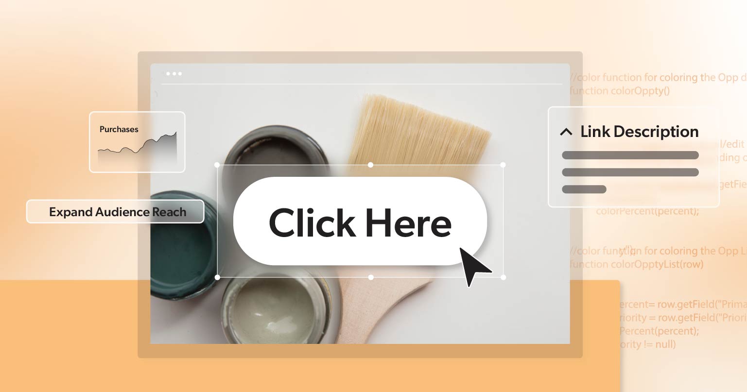
Links with vague or repetitive text like “click here” or “read more” can be confusing for screen reader users as they lack context about the link’s destination or purpose. For example, if several links are labeled “read more,” users may not know which topic they are referring to.
WCAG SC 2.4.4 Link Purpose (In Context) requires that the purpose of each link be clear from the link text alone or from the surrounding context. This helps users understand where a link will take them and ensures that all users can navigate effectively.
How to Fix:
- Use Descriptive Link Text: Ensure that the link text clearly indicates what the link will do or where it will take the user. For instance, instead of saying “click here,” use “Download our accessibility guide.”
- Avoid Repetition: Ensure that each link’s text is unique, especially if links are close to each other. This helps users distinguish between different links and understand their destinations.
- Provide Context in Surrounding Text: If necessary, add context around the link text to clarify its purpose. However, the link text itself should still be sufficiently descriptive on its own.
9. No Focus Indicators
Web accessible focus indicators are visual cues that show which part of a website a user is currently interacting with, like when using a keyboard or a screen reader.
According to WCAG SC 2.4.7 Focus Visible, “Focus Visible,” these indicators are crucial for making websites easy to navigate. Without them, users might struggle to see where they are on the page, which can make the site hard to use, especially for people with disabilities. Proper focus indicators help everyone use a website more effectively and inclusively.
How to Fix Focus Indicators:
- Ensure Visible Focus: Use CSS to create clear, visible focus indicators for all interactive elements. For example, you can use outline: 2px solid #000; to ad a solid black outline when an element is focused.
- Customize Focus Styles: Enhance default focus styles to make them more visible, especially if the default outline blends into the background. Consider using a contrasting color or a thicker border.
How to Test for Web Accessibility Issues
Testing for web accessibility can be done using a combination of manual checks and automated tools. Let’s take a look at a quick guide:
- Manual Testing: Use a keyboard to navigate your site and check all interactive elements. Utilize screen readers to ensure that content is read out correctly and that forms, buttons, and links are accessible.
- Automated Tools: Use tools like WAVE, Axe, or Lighthouse to perform automated accessibility audits. These tools can quickly identify many common issues, but manual testing is still essential for thorough accessibility checks.
- User Testing: If possible, involve users with disabilities in your testing process. They can provide valuable feedback on real-world accessibility issues that automated tools might miss.
Building a Path to Web Accessibility
Making sure your website is accessible goes beyond just checking off boxes—it’s about creating a welcoming space where everyone can connect with your content. By tackling common accessibility issues, you not only improve how people experience your site but also protect your organization from potential legal problems and open up new audience opportunities.
If you want to learn more about improving your website’s accessibility initiative, schedule a complimentary ADA strategy briefing with the experts at 216digital. We make web accessibility simple and achievable, helping you develop a strategy to integrate WCAG 2.1 compliance into your development roadmap on your terms.
Don’t let your website fall behind on accessibility. Let’s work together to make sure everyone can fully experience your site.


