Wunderlich America: Responsive Website Redesign
Clean, logical layout for BMW motorcycle enthusiasts.

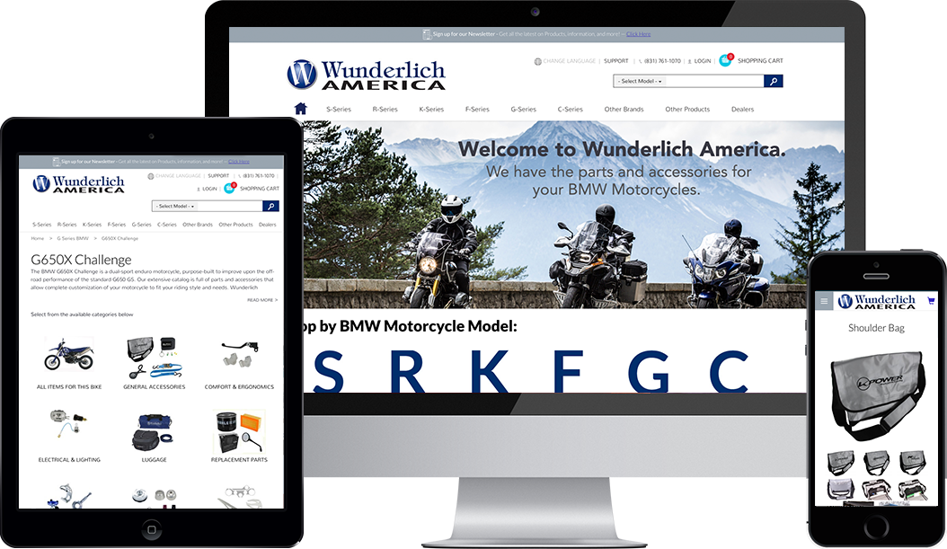
A mobile-responsive gateway to unforgettable riding experiences.
Wunderlich America sells the highest quality BMW motorcycle parts available on the web. Many of their parts are supplied by the original equipment manufacturers who build the factory parts for BMW, and all Wunderlich parts meet or exceed factory standards for quality, durability, and functionality.
Wunderlich customers love their motorcycles. They often know exactly what they’re looking for. The goal is to get the parts they need and get back to riding. To that end, we knew Wunderlich needed a clean, flat design and a logical UX (user experience) that would take customers right to the motorcycle parts they needed.

From separate mobile site to single mobile-friendly site.
When smartphones first took a slice of the web browsing pie, a lot of people recommended creating a separate website for mobile devices. While that is still (arguably) a solution in some cases, the vast majority of brands find a huge benefit in having a single website that looks great on all devices. That means updating one site rather than two. It literally cuts future publishing and development work in half.
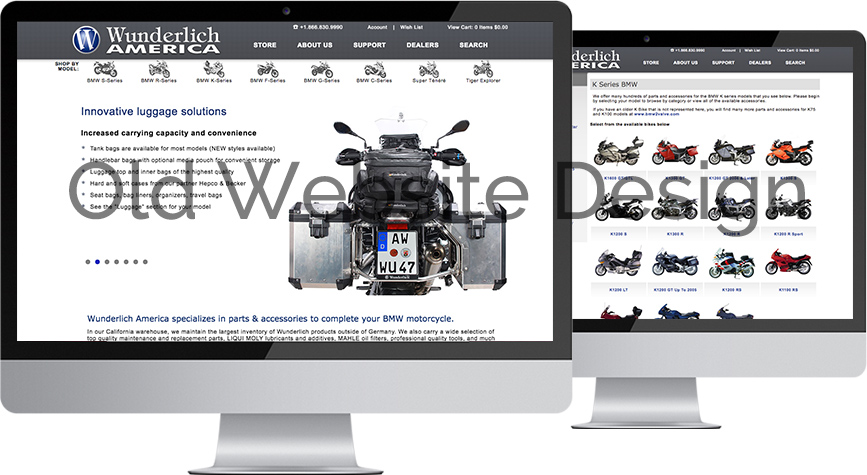
Before the redesign, Wunderlich had two websites—a desktop-optimized site, and a mobile-friendly site built with MvMobile, a responsive solution for the Miva ecommerce platform. The new site brings everything into one place. It looks great on all devices, and a single back-end update appears on the front end for users on all kinds of devices.

The new Wunderlich website: Well-crafted tweaks with huge results.
In web design, particularly UX, a subtle change goes a long way.
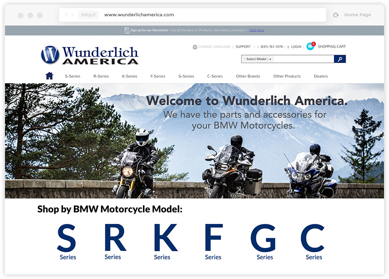
Wunderlich customers come to the site looking for parts for a specific BMW motorcycle. They don’t need to search the entire catalog—they only need to search within the model series to which their bike belongs. While Wunderlich’s old site was structured to support this navigation flow, we made this even easier with a large custom menu advertising each bike series. From this menu, users can enter the section of the catalog that pertains to that series.
Wunderlich’s search function needed an update, too. The search function supports the same segmentation by series, as it always had; but now, the search function is available at the top of every page. On the old site, the search function was only accessible on its own dedicated page.Ready to build Something Amazing?
Let’s get started!

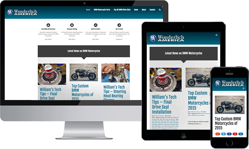
A new blog ready for high-powered content marketing in a hungry niche.
The motorcycle niche has a massive blogging community. Readers and writers share a strong passion for all aspects of riding. With Wunderlich’s great expertise in all things BMW, a revamped blog was a no-brainer.

Content marketing: a careful balance between publishing and commercial branding.
Content marketing for ecommerce can be a tricky proposition. Audiences expect high-quality content, not a sales pitch. But marketers can only justify the expense of publishing if it ultimately furthers a commercial goal. While the content itself is the biggest denominator in the success of a content marketing campaign, we find that design is one of the most important supporting elements.
For the Wunderlich America blog, we created a design that harmonizes with Wunderlich’s existing branding but doesn’t look like another page on an ecommerce store. The goal was to create a real, stand-alone blog with a magazine feel. That way, Wunderlich’s great content would be more likely to generate backlinks which might not have happened if the blog content looked overtly commercial.
The Bottom Line
At 216digital, we adapt the principles of web and UX design to a wide variety of clients and markets. No two projects look the same here. The one constant? We build gorgeous, high-performing sites that are prime examples of their type.
If you’re looking for responsive ecommerce design and development, drop us a line. Let’s start talking about your next big thing.